An Amateur Primer On Classic Typefaces.
The world of fonts and typefaces is vast and confusing. It is my goal in this article to explain what worked for me, and provide a kind of roadmap to timeless, classic fonts to be used in all of your designs.
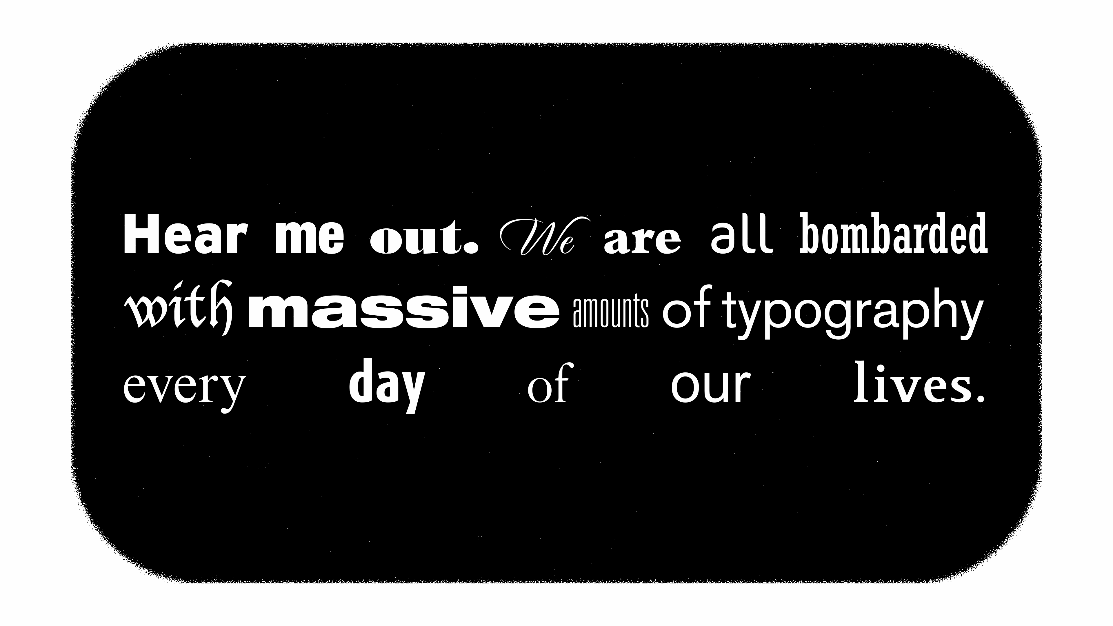
Much like any other consumable digital format, there is a lot of spam in the world of fonts: a lot of low-effort typefaces and font files, incomplete character sets, files garbled by memory loss or bad sectors during duplication. There even exists malicious code, trojan-horses and viruses embedded in some font files. The sites that come up when you search for fonts are often predatory bait-and-switch gateways to more spam. Beyond that, there are fonts that are illegible at various resolutions, or all resolutions. From a design stand-point, many fonts are inappropriate for a given use-case, cliché, overused, or are poor interpretations of regarded classics.
The world of fonts and typefaces is vast and confusing. It is my goal in this article to explain what worked for me, and provide a kind of roadmap to timeless, classic fonts that can be used in all of your designs.
If you are conducting a deep-dive in this subject, you are not alone. You don't have to start from scratch, even if you don't know anything about typefaces and fonts.
Before we continue, I must disclose that I am not a professional typographer or graphic-designer. I am an amateur, at best. I am merely a passionate hobbyist. Feel free to take this article with a grain-of-salt, or discard it entirely. I know my methodology is flawed. Maybe this whole article is fundamentally or conceptually flawed. If you think this is the case, please log-in and leave a comment. I am open to the possibility that I am partially or completely wrong, and I don't mind being corrected by someone who is a professional or has more experience in the field than me. Furthermore, I have no formal training in research and I am sure there are resources for designers that I am not aware of that could've eased this process of discovery for me. I am simply reporting what I know so far, and how I know it. I was working with the tools and resources I knew of at the time. If there's anything I missed, let me know.

The extent of my formal training in typography is tangential to my training in graphic design. I took one summer course in photography and graphic design at Academy of Art in 1993. I am otherwise self-taught. Back then we were working with Adobe Photoshop 2.0, large, expensive purple AFGA flat-bed scanners with SCSI interfaces, and gigantic data storage cartridges that held up to forty-four megabytes by SyQuest. We've come a long way since then technologically. But some things like typography, remain timeless.
You don't need thousands of typefaces to get started in typography or design. Maybe a dozen or a few dozen will serve you well for years, if you choose the right ones. If you are new to typography and design as I am, my advice is to begin with a few of the classics. Why do I say this? For starters they are guaranteed to be legible at a variety of resolutions and sizes. Another reason is they are ingrained in our collective psyche. They are instantly recognizable, even if you are not a designer. You might consider many of the typefaces listed here downright boring. Most of us take it for granted that each one of these typefaces represents thousands, sometimes tens-of-thousands of hours of research and diligent work. A significant portion of the typographer's life-work. I salute typographers, their painstaking attention to the smallest details, persistence and commitment to their art-form is on another level.
Designers know this. Sometimes, a font is used as a part of a graphic or is the graphic. If you are employing typography in this way, go wild. In these cases, less is less.
However, you don't need a wacky font to stand out. If you can capture attention with an understated font, sometimes as they say, less is more.
As with life, there is power in subtlety. You can grasp that power with the right typographic choices in your designs.
This is not a typography primer. It is a typeface primer. I don't explain typographical concepts and classifications. This article assumes you know what a serif font is versus a sans-serif font. And you can pretty much guess what a script typeface looks like versus a slab-serif. However, I will say it is important to understand what I mean when I say font, font-face (interchangeable) or typeface (discrete). Basically a typeface is a typographic family with a common ancestor. Fonts are the family members. They have many descriptors, regular, book, display, italic, bold, condensed, heavy, etc. A typeface can have dozens of fonts or even hundreds of fonts or font-faces. If you are totally unfamiliar with these concepts and would like an gentle introduction to the basics of typography, I recommend this article by renderforest.
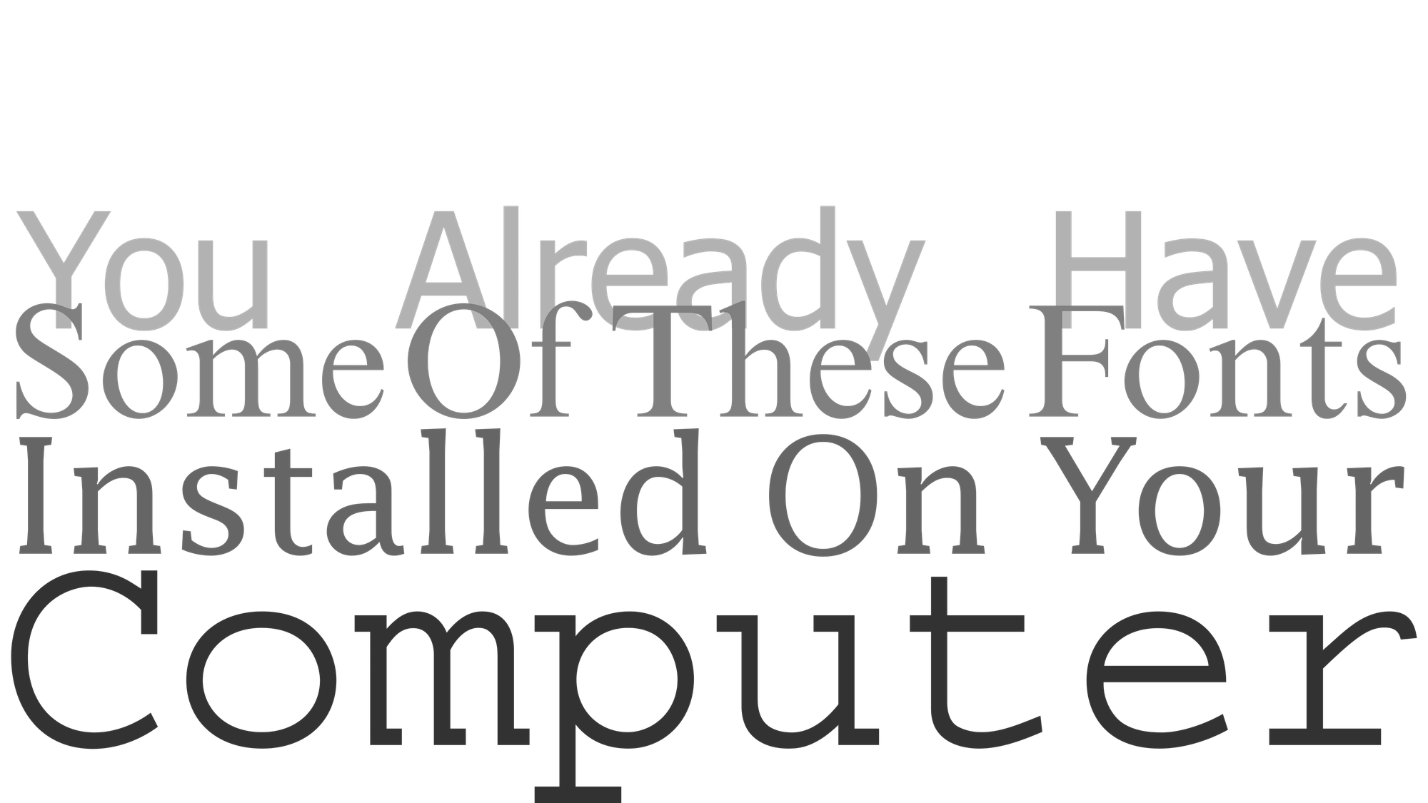
Some of these typefaces you may already have. In particular, the ones originating from IBM, Microsoft Corporation or Apple. Additionally, if you have a graphics program, like one from Adobe for example, you are likely to have a few more of the typefaces I am about to list. Before you go on an all-night downloading bender like I did, check out what you've already got.
That's why I provide links to major font distributors which provide commercial licenses (paid fonts), and major font distributors who provide open source licenses (free fonts) toward the end of this article. I am planning a whole article devoted to opensource fonts in the future.

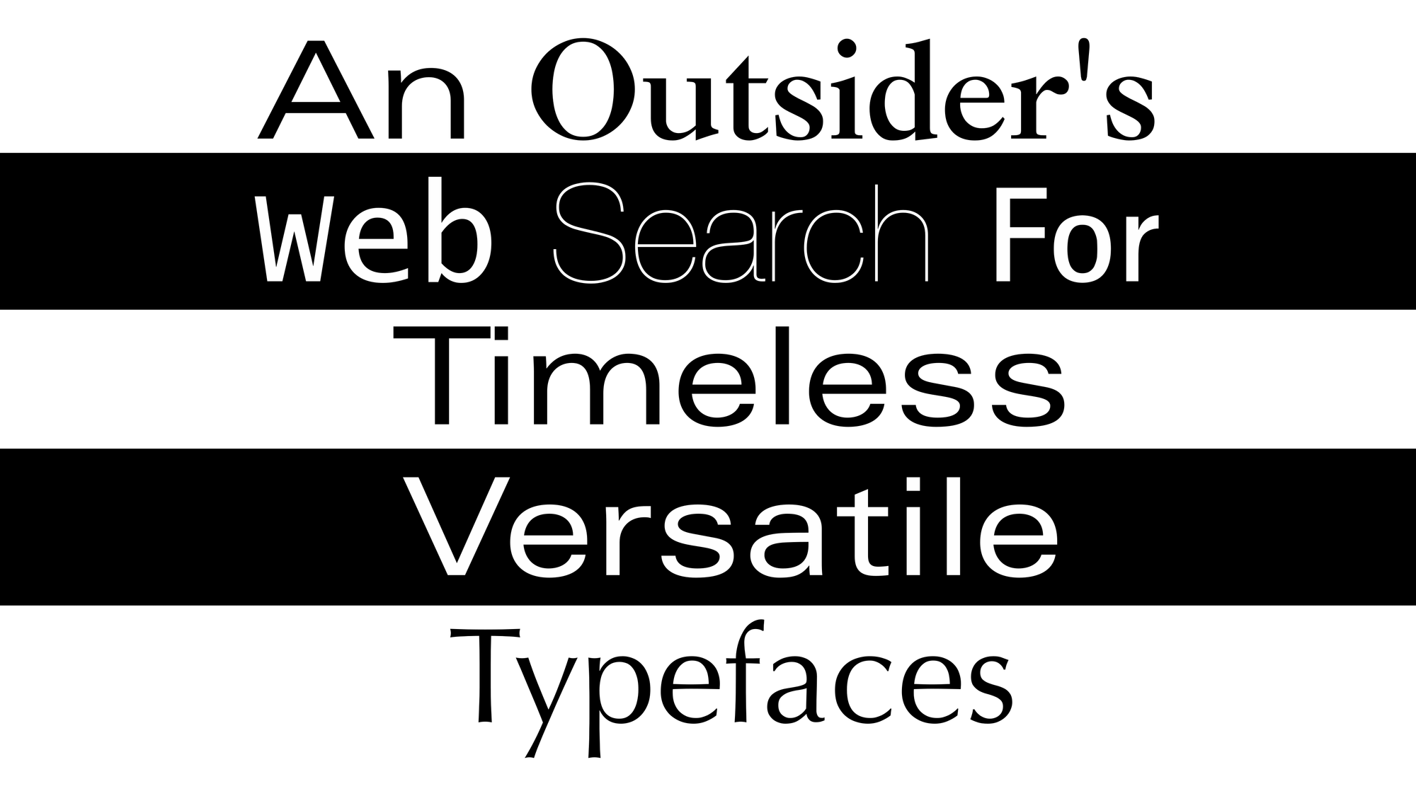
I don't have limitless resources or time. So, being the resourceful or lazy person I am, I decided to educate myself on what typefaces designers swear-by with a web search. This is definitely a your-mileage-may-vary situation, and I know some readers will take issue with my methodology. It is definitely not the last word, but maybe it gets me in the ball-park.
I typed in the search bar, "classic typefaces every designer should have," and kept a tally of which typefaces were listed on each site for the first few pages of results.
For each of these fonts, I provide a Wikipedia link. Much of the text blurbs below were shamelessly lifted from Wikipedia wholesale, so take that into consideration. Wikipedia is sometimes wrong. It is nice to have all the relevant information in one place without the data-overload of the Wikipedia site though. They are listed first by their frequency, and then by alphabetical order.
The line between teacher and student can be quite thin. I have learned a lot by simply writing this article, and you, dear reader are learning with me.
Typefaces Listed Five Or More Times
The most mentioned typefaces.
Released in 1989, Adobe Garamond is designed by Robert Slimbach for Adobe Systems following a research visit to the Plantin-Moretus Museum, based on a Roman type by Garamond and an italic type by Robert Granjon. The font family has 3 weights (Regular, Semibold, and Bold), each with its respective italic, totalling 6 styles. Its quite even, mature design attracted attention on release for its authenticity, in contrast to the much more aggressive ITC Garamond popular at the time. It is one of the most popular versions of Garamond in books and fine printing. Slimbach decided not to base the design directly on Garamond types in the 9–15pt sizes normally used for book text, but on a larger type called parangonne or vraye parangonne, which he felt was Garamond's "most attractive work".
It was reviewed by Hugh Williamson for the Printing Historical Society as "well-suited to photocomposition and to offset printing". It also received two detailed reviews in the same issue of Printing History, both a favourable one by Jery Kelly and a more critical one by book designer Mark Argetsinger. Argetsinger felt that while the parangonne type was "a very beautiful design", the choice to base a text type on it produced a type of "relative pallidness" when printed by lithography. He recommended that Adobe add more optical sizes.
Avenir is a geometric sans-serif typeface designed by Adrian Frutiger in 1987 and released in 1988 by Linotype GmbH.
The word avenir is French for 'future'. As the name suggests, the family takes inspiration from the geometric style of sans-serif typeface developed in the 1920s that took the circle as a basis, such as Erbar and Futura. Frutiger intended Avenir to be a more organic interpretation of the geometric style, more even in colour and suitable for extended text, with details recalling more traditional typefaces such as the two-storey 'a' and 't' with a curl at the bottom, and letters such as the 'o' that are not exact, perfect circles but optically corrected.
Frutiger described Avenir as his finest work: "The quality of the draftsmanship – rather than the intellectual idea behind it – is my masterpiece. (...) It was the hardest typeface I have worked on in my life. Working on it, I always had human nature in mind. And what's crucial is that I developed the typeface alone, in peace and quiet – no drafting assistants, no-one was there. My personality is stamped upon it. I'm proud that I was able to create Avenir."
Bodini is the name given to the serif typefaces first designed by Giambattista Bodoni (1740–1813) in the late eighteenth century and frequently revived since. Bodoni's typefaces are classified as Didone or modern. Bodoni followed the ideas of John Baskerville, as found in the printing type Baskerville—increased stroke contrast reflecting developing printing technology and a more vertical axis—but he took them to a more extreme conclusion. Bodoni had a long career and his designs changed and varied, ending with a typeface of a slightly condensed underlying structure with flat, unbracketed serifs, extreme contrast between thick and thin strokes, and an overall geometric construction.
When first released, Bodoni and other didone fonts were called classical designs because of their rational structure. However, these fonts were not updated versions of Roman or Renaissance letter styles, but new designs. They came to be called 'modern' serif fonts; since the mid-20th century, they are also known as Didone designs.
Some digital versions of Bodoni are said to be hard to read due to "dazzle" caused by the alternating thick and thin strokes, particularly as the thin strokes are very thin at small point sizes. This is very common when optical sizes of font intended for use at display sizes are printed at text size, at which point the hairline strokes can recede to being hard to see. Versions of Bodoni that are intended to be used at text size are "Bodoni Old Face", optimized for 9 points; ITC Bodoni 12 (for 12 points); and ITC Bodoni 6 (for 6 points).
Massimo Vignelli stated that "Bodoni is one of the most elegant typefaces ever designed." In the English-speaking world, "modern" serif designs like Bodoni are most commonly used in headings and display uses and in upmarket magazine printing, which is often done on high-gloss paper that retains and sets off the crisp detail of the fine strokes. In Europe, they are more often used in body text.
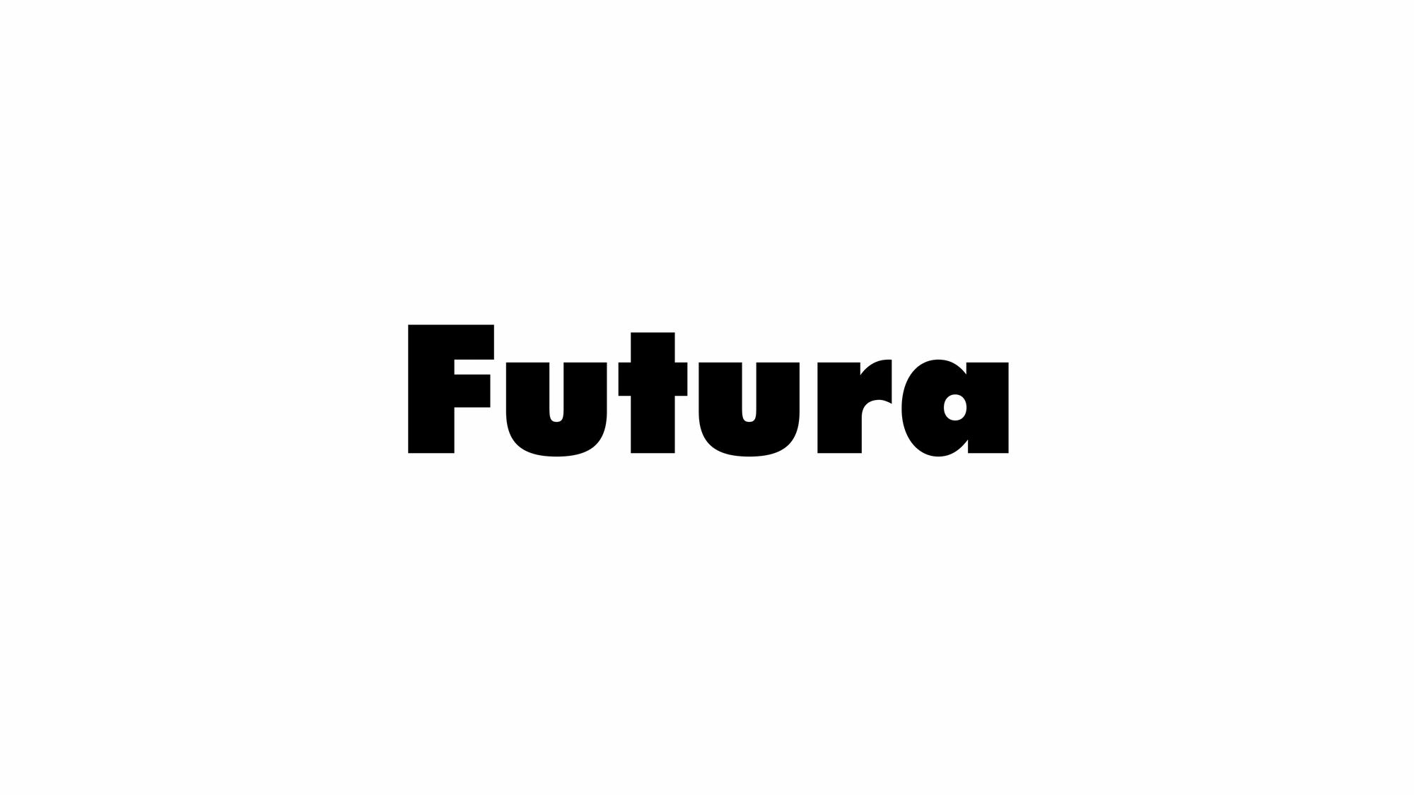
Futura is a geometric sans-serif typeface designed by Paul Renner and released in 1927.[1] Designed as a contribution on the New Frankfurt-project, it is based on geometric shapes, especially the circle, similar in spirit to the Bauhaus design style of the period.[2][3] It was developed as a typeface by Bauersche Gießerei, in competition with Ludwig & Mayer's seminal Erbar typeface.[4][5]
Although Renner was not associated with the Bauhaus, he shared many of its idioms and believed that a modern typeface should express modern models, rather than be a revival of a previous design. Renner's design rejected the approach of most previous sans-serif designs (now often called grotesques), which were based on the models of signpainting, condensed lettering and nineteenth-century serif typefaces, in favour of simple geometric forms: near-perfect circles, triangles and squares. It is based on strokes of near-even weight, which are low in contrast. The lowercase has tall ascenders, which rise above the cap line, and uses nearly-circular, single-storey forms for the "a" and "g", the former previously more common in handwriting than in printed text.[a] The uppercase characters present proportions similar to those of classical Roman capitals.[7] The original metal type showed extensive adaptation of the design to individual sizes, and several divergent digitisations have been released by different companies.[8]
Futura was extensively marketed by Bauersche Gießerei and its American distribution arm by brochure as capturing the spirit of modernity, using the German slogan "die Schrift unserer Zeit" ["the typeface of our time"] and in English "the typeface of today and tomorrow".[9][10] It has remained popular since then.[5][11]
Since 2001, Futura has been a registered trademark of Bauer Types, S.L. in the UK, the US, and the EU.
Because of the Rule of the shorter term, Futura will enter the public domain worldwide in 2027, as the copyright to the Futura design expires 70 years after the death of Paul Renner in the origin country, Germany. However, Bauer Types, S.L. will retain trademark rights to the name "Futura" in the territories where the registration continues..
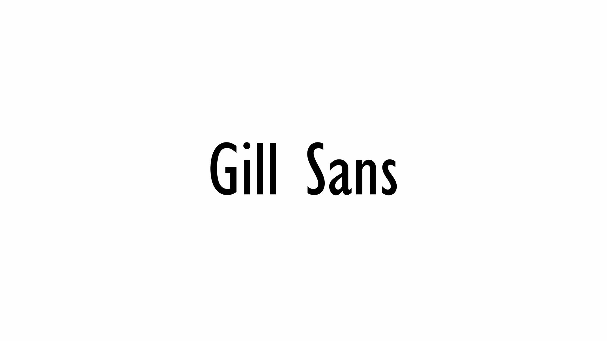
Gill Sans is a humanist sans-serif typeface designed by Eric Gill and released by the British branch of Monotype in 1928. It is based on Edward Johnston's 1916 "Underground Alphabet", the corporate typeface of London Underground.
As a young artist, Gill had assisted Johnston in its early development stages. In 1926, Douglas Cleverdon, a young printer-publisher, opened a bookshop in Bristol, and Gill painted a fascia for the shop for him using sans-serif capitals. In addition, Gill sketched an alphabet for Cleverdon as a guide for him to use for future notices and announcements. By this time, Gill had become a prominent stonemason, artist and creator of lettering in his own right, and had begun to work on creating typeface designs.
Gill was commissioned to develop his alphabet into a full type family by his friend Stanley Morison, an influential Monotype executive and historian of printing. Morison hoped that it could be Monotype's competitor to a wave of German sans-serif families in a new "geometric" style, which included Erbar, Futura and Kabel, all of which had been launched to considerable attention in Germany during the late 1920s. Gill Sans was initially released as a set of titling capitals that was quickly followed by a lower-case. Gill's aim was to blend the influences of Johnston, classic serif typefaces and Roman inscriptions to create a design that looked both cleanly modern and classical at the same time. Because Gill Sans was designed before the practice of setting documents entirely in sans-serif text became common, its standard weight is noticeably bolder than most modern body text fonts.
Gill Sans was an immediate success; a year after its release, the London and North Eastern Railway (LNER) chose the typeface for all its posters, timetables and publicity material. British Railways chose Gill Sans as the basis for its standard lettering when the Big Four railway companies were nationalised in 1948. Gill Sans also soon became used on the deliberately simple modernist covers of Penguin Books, and was sold up to very large font sizes, which were often used in British posters and notices of the period. Gill Sans was one of the dominant typefaces in British printing in the years after its release, and remains extremely popular. It has been described as "the British Helvetica" because of its lasting popularity in British design. Gill Sans has influenced many other typefaces and helped to define a genre of sans-serif, known as the humanist style.
Monotype rapidly expanded the original regular or medium weight into a large family of styles, which it continues to sell. A basic set is included with some Microsoft software and macOS fonts.
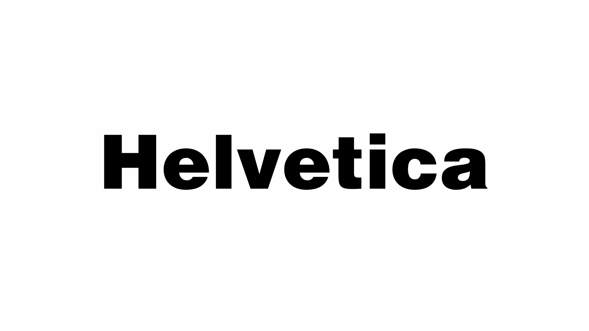
Helvetica, also known by its original name Neue Haas Grotesk, is a widely-used sans-serif typeface developed in 1957 by Swiss typeface designer Max Miedinger and Eduard Hoffmann.
Helvetica is a neo-grotesque design, one influenced by the famous 19th-century (1890s) typeface Akzidenz-Grotesk and other German and Swiss designs. Its use became a hallmark of the International Typographic Style that emerged from the work of Swiss designers in the 1950s and 1960s, becoming one of the most popular typefaces of the mid-20th century. Over the years, a wide range of variants have been released in different weights, widths, and sizes, as well as matching designs for a range of non-Latin alphabets. Notable features of Helvetica as originally designed include a high x-height, the termination of strokes on horizontal or vertical lines and an unusually tight spacing between letters, which combine to give it a dense, solid appearance.
Developed by the Haas'sche Schriftgiesserei (Haas Type Foundry) of Münchenstein (Basel), Switzerland, its release was planned to match a trend: a resurgence of interest in turn-of-the-century "grotesque" sans-serifs among European graphic designers, that also saw the release of Univers by Adrian Frutiger the same year. Hoffmann was the president of the Haas Type Foundry, while Miedinger was a freelance graphic designer who had formerly worked as a Haas salesman and designer.
Originally named Neue Haas Grotesk (New Haas Grotesque), it was soon licensed by Linotype and renamed Helvetica in 1960, which in Latin means 'Swiss', from Helvetia, capitalising on Switzerland's reputation as a centre of ultra-modern graphic design.
Typefaces Listed Four Times
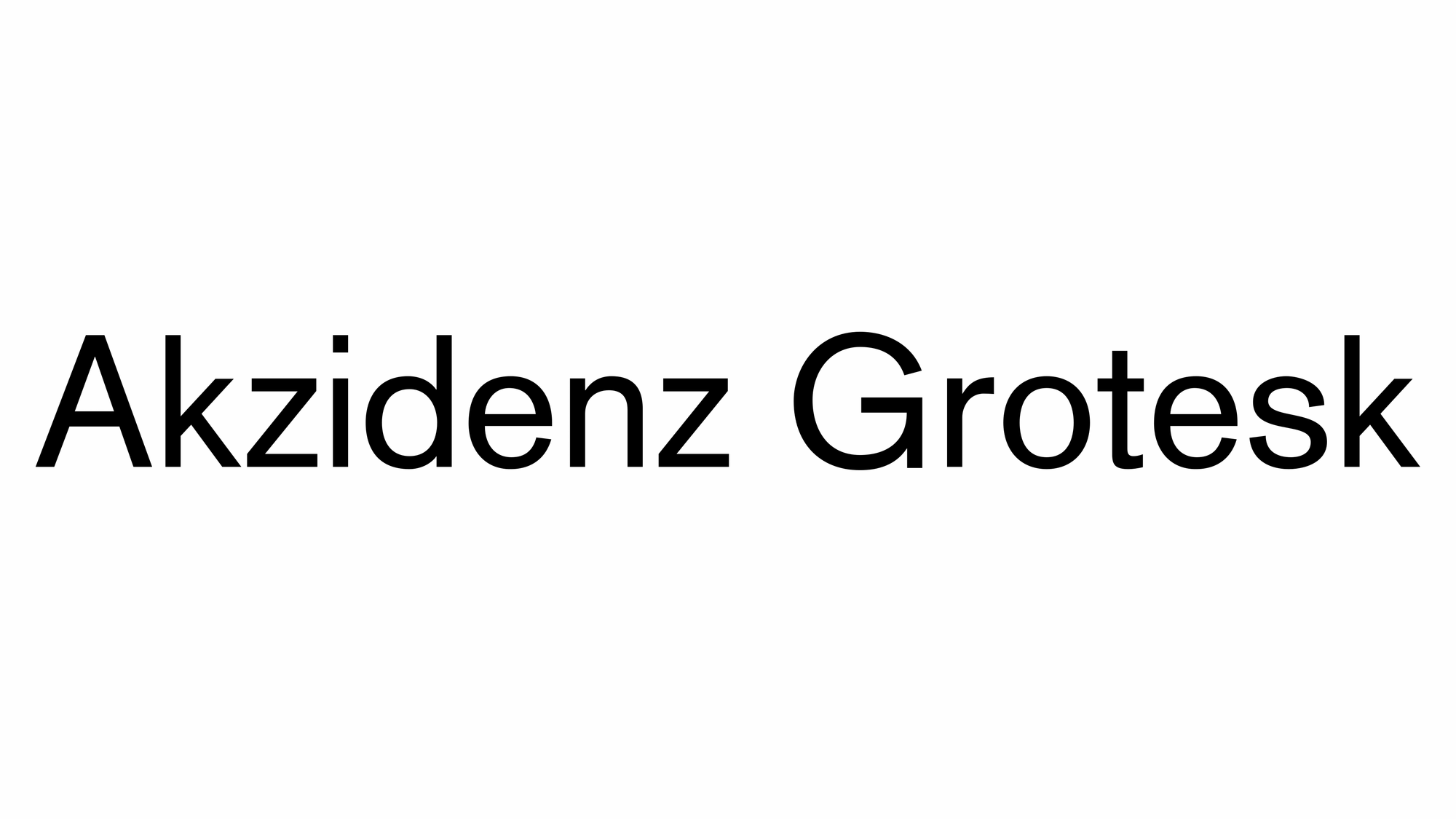
Akzidenz Grotesk is a sans-serif typeface family originally released by the Berthold Type Foundry of Berlin in 1898. "Akzidenz" indicates its intended use as a typeface for commercial print runs such as publicity, tickets and forms, as opposed to fine printing, and "grotesque" was a standard name for sans-serif typefaces at the time.
Originating during the late nineteenth century, Akzidenz-Grotesk belongs to a tradition of general-purpose, unadorned sans-serif types that had become dominant in German printing during the nineteenth century. Relatively little-known for a half-century after its introduction, it achieved iconic status in the post-war period as the preferred typeface of many Swiss graphic designers in what became called the "International" or "Swiss" design style which became popular across the Western world in the 1950s and 1960s. Its simple, neutral design has also influenced many later typefaces. It has sometimes been sold as Standard in English-speaking countries, and a variety of digital versions have been released by Berthold and other companies.
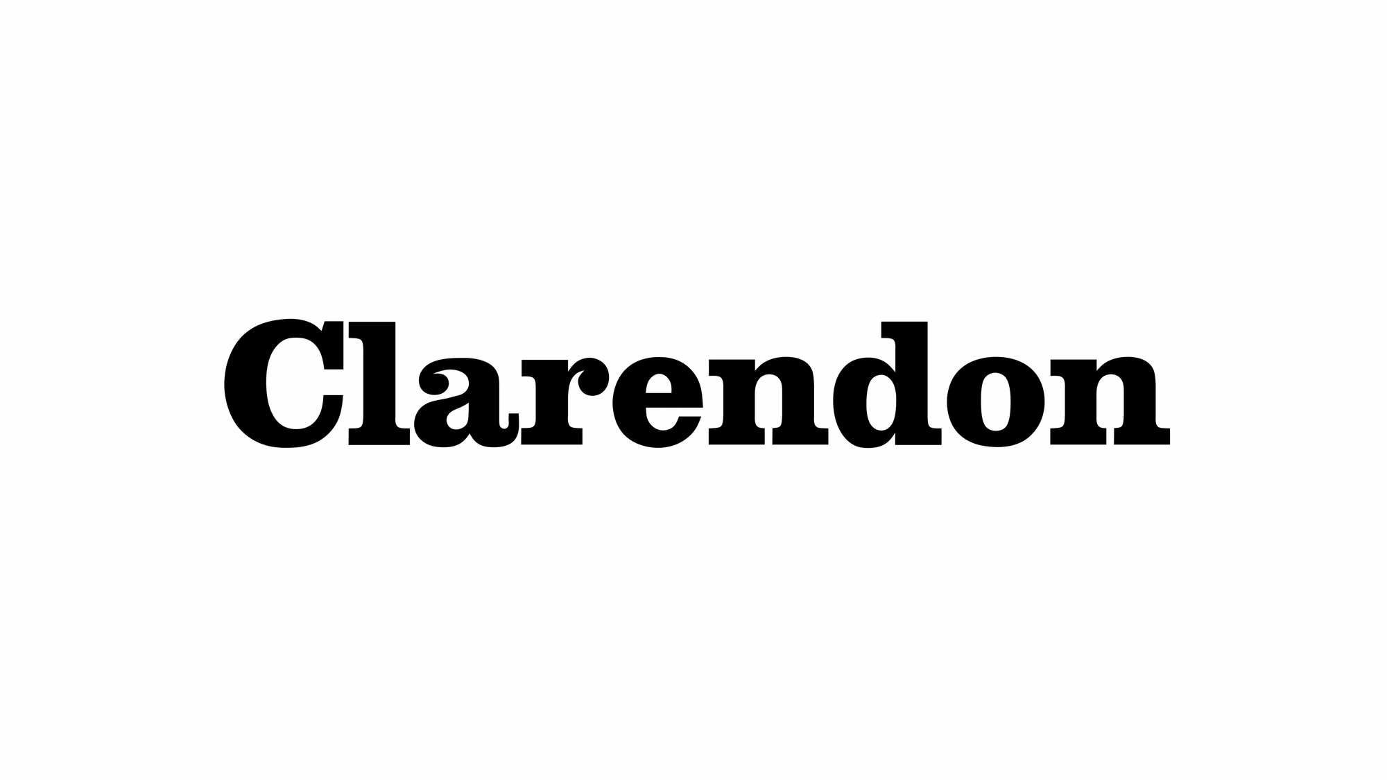
Clarendon is a slab serif typeface that was released in 1845 by Thorowgood and Co. (or Thorowgood and Besley) of London, a letter foundry often known as the Fann Street Foundry. The original Clarendon design is credited to Robert Besley, a partner in the foundry, and was originally engraved by punchcutter Benjamin Fox, who may also have contributed to its design. Many copies, adaptations and revivals have been released, becoming almost an entire genre of type design.
Clarendon has a bold, solid structure, similar in letter structure to the "modern" serif typefaces popular in the nineteenth century for body text (for instance showing an 'R' with a curled leg, and ball terminals on the 'a' and 'c'), but bolder and with less contrast in stroke weight. Clarendon designs generally have a structure with bracketed serifs, which become larger as they reach the main stroke of the letter. Mitja Miklavčič describes the basic features of Clarendon designs (and ones labelled Ionic, often quite similar) as: "plain and sturdy nature, strong bracketed serifs, vertical stress, large x-height, short ascenders and descenders, typeface with little contrast" and supports Nicolete Gray's description of them as a "cross between the roman [general-purpose body text type] and slab serif model". Gray notes that nineteenth-century Ionic and Clarendon faces have "a definite differentiation between the thick and the thin strokes", unlike some other more geometric slab serifs.
Slab serif typefaces had become popular in British lettering and printing over the previous thirty-five years before the original Clarendon's release, both for display use on signage, architectural lettering and posters and for emphasis within a block of text. The Clarendon design was immediately very popular and was rapidly copied by other foundries to become in effect an entire genre of type design. Clarendon fonts proved extremely popular in many parts of the world, in particular for display applications such as posters printed with wood type. They are therefore commonly associated with wanted posters and the American Old West. A revival of interest took place in the post-war period: Jonathan Hoefler comments that "some of the best and most significant Clarendons are twentieth century designs" and highlights the Haas and Stempel foundry's bold, wide Clarendon display face as "a classic that for many people is the epitome of the Clarendon style."
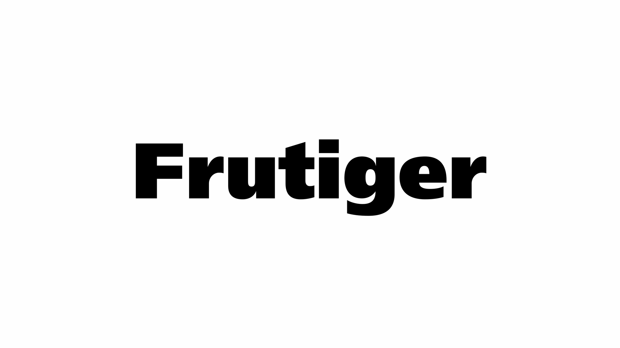
Frutiger is a series of typefaces named after its Swiss designer, Adrian Frutiger. Frutiger is a humanist sans-serif typeface, intended to be clear and highly legible at a distance or at small text sizes. A popular design worldwide, type designer Steve Matteson described its structure as "the best choice for legibility in pretty much any situation" at small text sizes, while Erik Spiekermann named it as "the best general typeface ever".
Notable Typefaces I Have Not Acquired Or Installed
Franklin Gothic and its related faces are a large family of sans-serif typefaces in the industrial or grotesque style developed in the early years of the 20th century by the type foundry American Type Founders (ATF) and credited to its head designer Morris Fuller Benton. "Gothic" was a contemporary term (now little-used except to describe period designs) meaning sans-serif.
Typefaces Listed Three Times
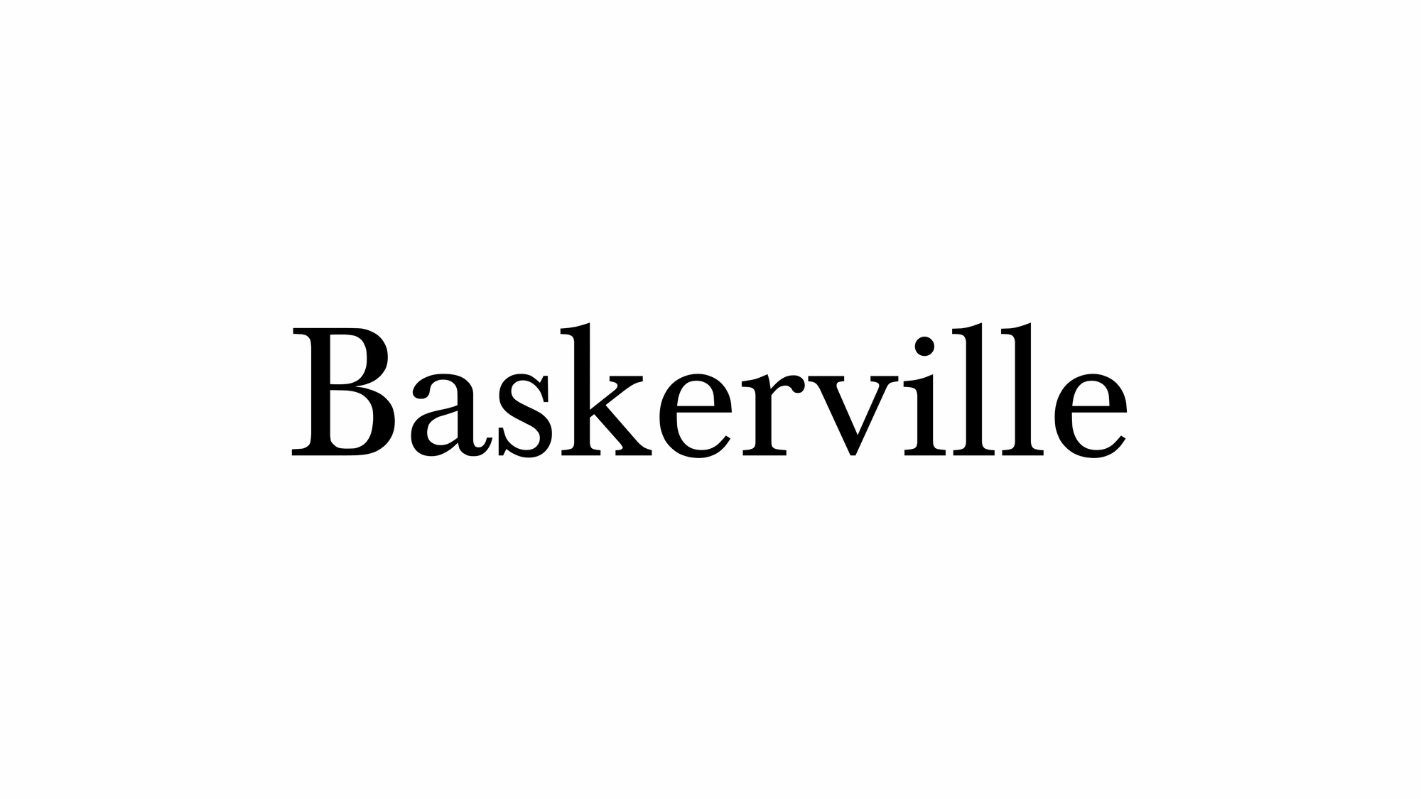
Baskerville is a serif typeface designed in 1757 by John Baskerville in Birmingham, England, and cut into metal by punchcutter John Handy. Baskerville is classified as a transitional typeface, intended as a refinement of what are now called old-style typefaces of the period, especially those of his most eminent contemporary, William Caslon.
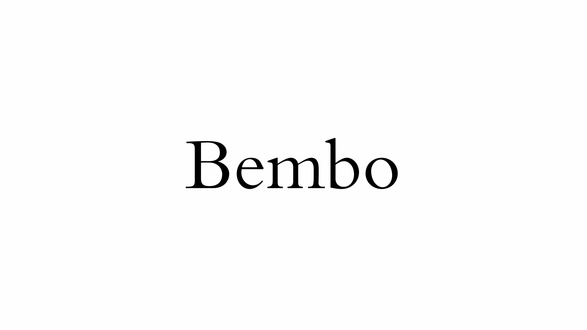
Bembo is a serif typeface created by the British branch of the Monotype Corporation in 1928–1929 and most commonly used for body text. It is a member of the "old-style" of serif fonts, with its regular or roman style based on a design cut around 1495 by Francesco Griffo for Venetian printer Aldus Manutius, sometimes generically called the "Aldine roman". Bembo is named after Manutius's first publication with it, a small 1496 book by the poet and cleric Pietro Bembo. The italic is based on work by Giovanni Antonio Tagliente, a calligrapher who worked as a printer in the 1520s, after the time of Manutius and Griffo.
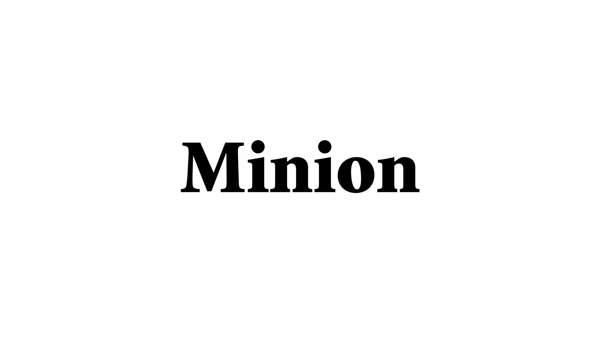
Minion is a serif typeface released in 1990 by Adobe Systems. Designed by Robert Slimbach, it is inspired by late Renaissance-era type and intended for body text and extended reading. Minion's name comes from the traditional naming system for type sizes, in which minion is between nonpareil and brevier, with the type body 7pt in height. As the historically rooted name indicates, Minion was designed for body text in a classic style, although slightly condensed and with large apertures to increase legibility. Slimbach described the design as having "a simplified structure and moderate proportions." The design is slightly condensed, although Slimbach has said that this was intended not for commercial reasons so much as to achieve a good balance of the size of letters relative to the ascenders and descenders.
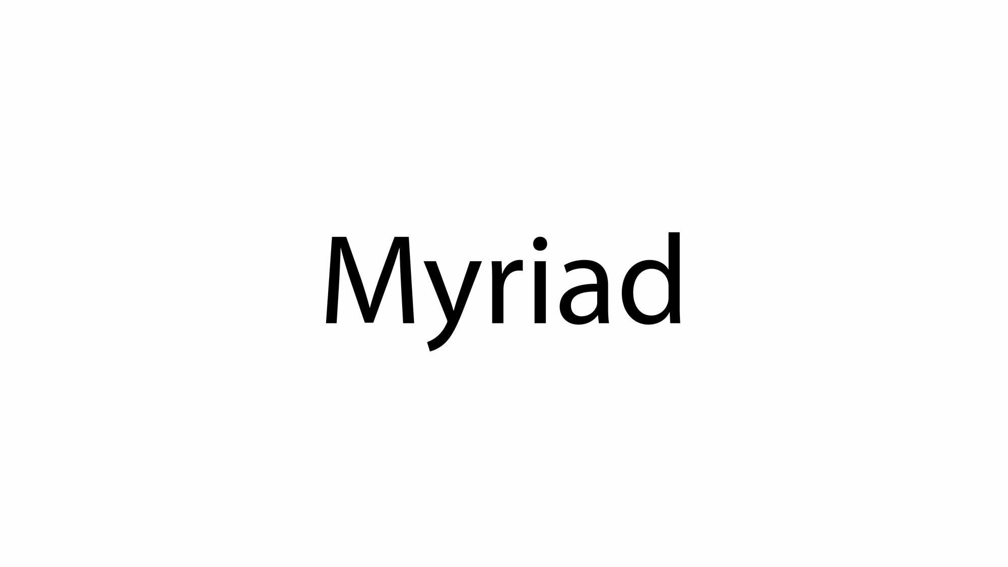
Myriad is a humanist sans-serif typeface designed by Robert Slimbach and Carol Twombly for Adobe Systems. Myriad was intended as a neutral, general-purpose typeface that could fulfill a range of uses and have a form easily expandable by computer-aided design to a large range of weights and widths. Myriad is known for its usage by Apple Inc., replacing Apple Garamond as Apple's corporate font from April 29, 2002, to January 24, 2017. Myriad is easily distinguished from other sans-serif fonts due to its "y" descender (tail) and slanting "e" cut.
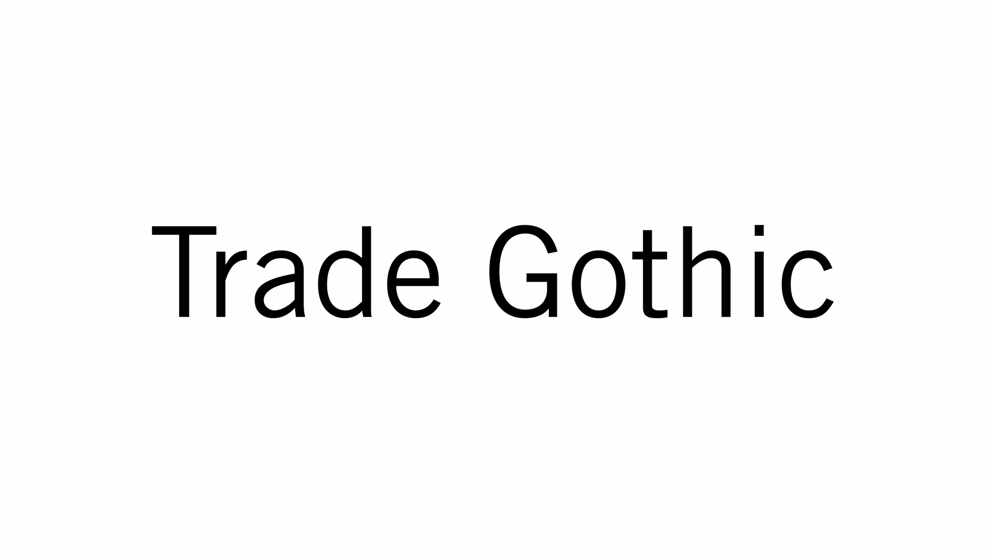
Trade Gothic is a sans-serif typeface designed in 1948 by Jackson Burke (1908–1975), who continued to work on further style-weight combinations, eventually 14 in all, until 1960, while he was director of type development for Linotype in the US. The family includes three weights and three widths.

Univers is a sans-serif typeface family designed by Adrian Frutiger and released by his employer Deberny & Peignot in 1957. Classified as a neo-grotesque sans-serif, one based on the model of nineteenth-century German typefaces such as Akzidenz-Grotesk, it was notable for its availability from the moment of its launch in a comprehensive range of weights and widths. The original marketing for Univers deliberately referenced the periodic table to emphasise its scope.
Typefaces Listed Twice
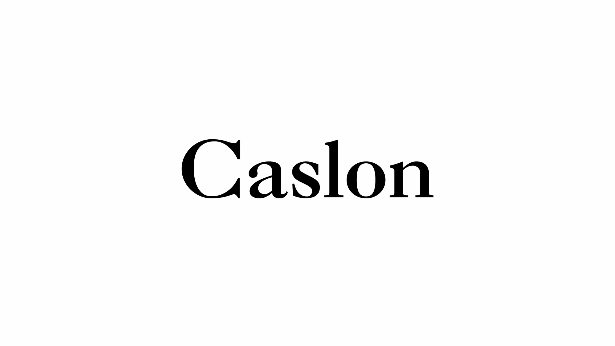
Adobe Caslon is a very popular revival designed by Carol Twombly. It is based on Caslon's own specimen pages printed between 1734 and 1770 and is a member of the Adobe Originals programme. It added many features now standard in high-quality digital fonts, such as small caps, old style figures, swash letters, ligatures, alternate letters, fractions, subscripts and superscripts, and matching ornaments. Adobe Caslon is used for body text in The New Yorker and is one of the two official typefaces of the University of Virginia and the University of Southern California. It is also available with Adobe's Typekit programme, in some weights for free.
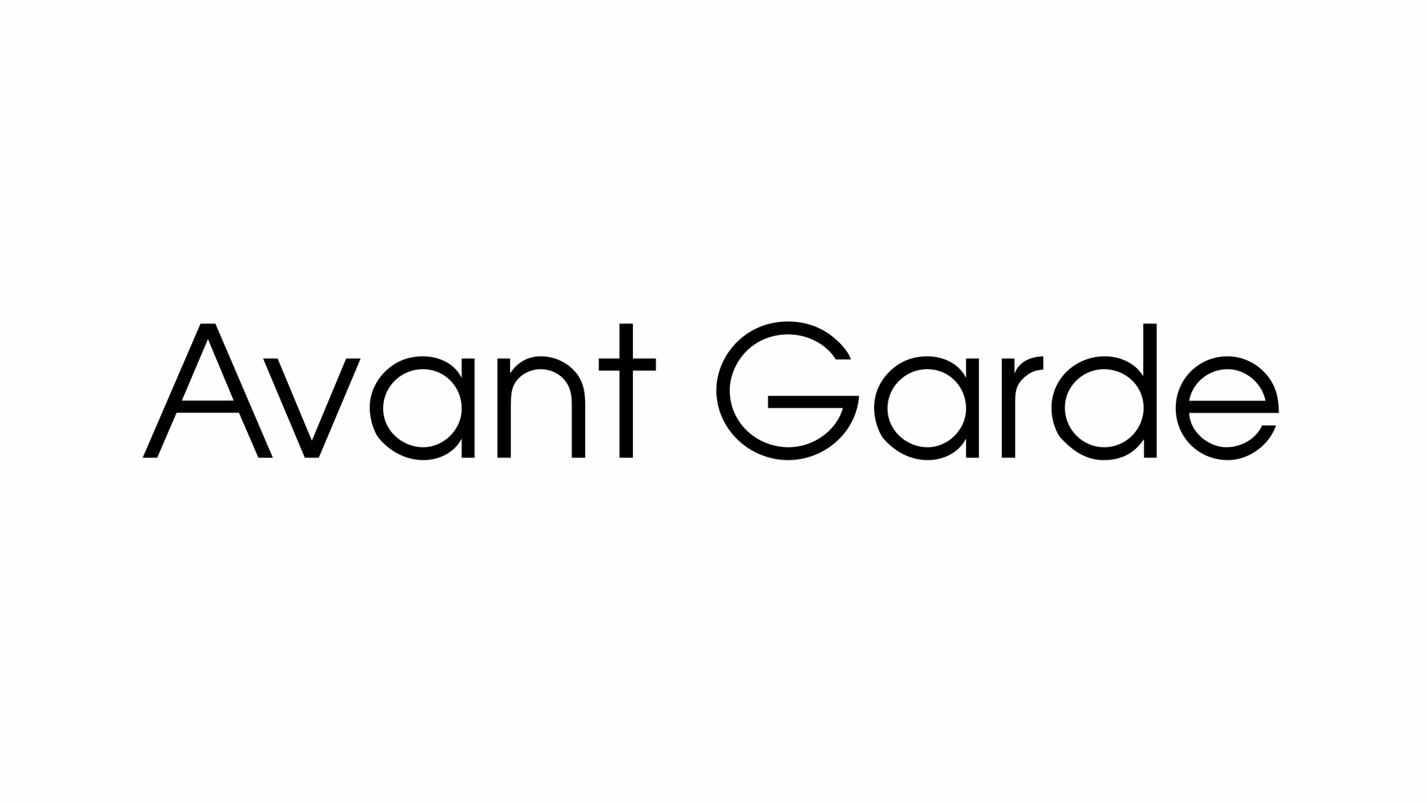
ITC Avant Garde Gothic is a geometric sans serif font family based on the logo font used in the Avant Garde magazine. Herb Lubalin devised the logo concept and its companion headline typeface, and then he and Tom Carnase, a partner in Lubalin's design firm, worked together to transform the idea into a full-fledged typeface. The condensed fonts were drawn by Ed Benguiat in 1974, and the obliques were designed by André Gürtler, Erich Gschwind and Christian Mengelt [de] in 1977.

DIN 1451 is a sans-serif typeface that is widely used for traffic, administrative and technical applications. It was defined by the German standards body DIN (Deutsches Institut für Normung, 'German Institute for Standardisation', pronounced like the English word din) in the standard sheet DIN 1451-Schriften ('typefaces') in 1931. Similar standards existed for stencilled letters.
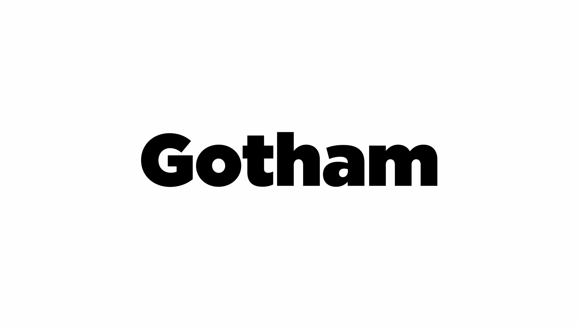
Gotham is a geometric sans-serif typeface family designed in 2000 by American type designer Tobias Frere-Jones with Jesse Ragan and released through the Hoefler & Frere-Jones foundry in 2002. Gotham's letterforms were inspired by examples of architectural signs of the mid-twentieth century. Gotham has a relatively broad design with a reasonably high x-height and wide apertures.
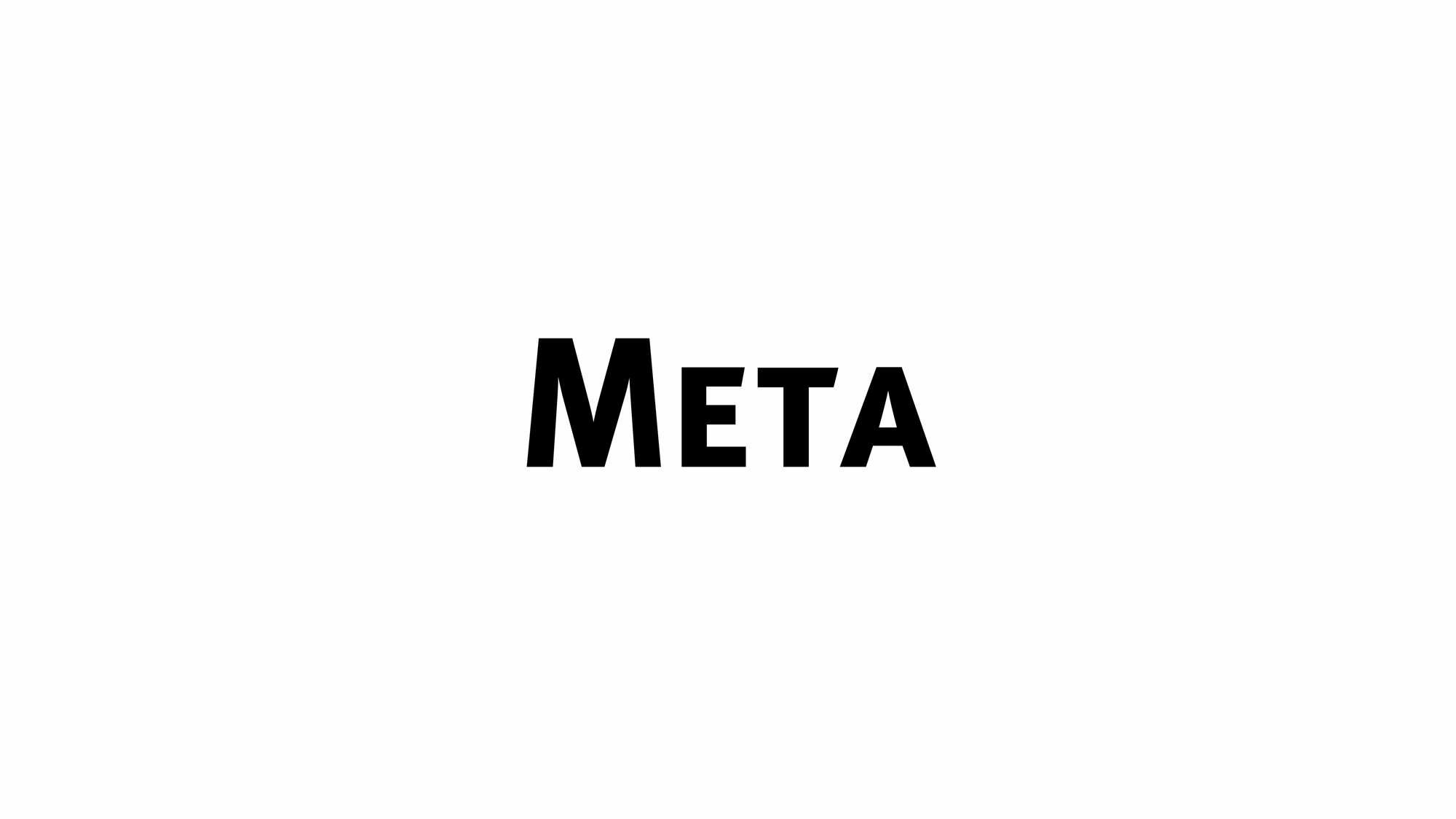
FF Meta is a humanist sans-serif typeface family designed by Erik Spiekermann and released in 1991 through his FontFont library. According to Spiekermann, FF Meta was intended to be a "complete antithesis of Helvetica", which he found "boring and bland". It originated from an unused commission for the Deutsche Bundespost (German Federal Post Office). Throughout the 1990s, FF Meta was embraced by the international design community with Spiekermann and E. M. Ginger writing that it had been dubiously praised as the Helvetica of the 1990s.
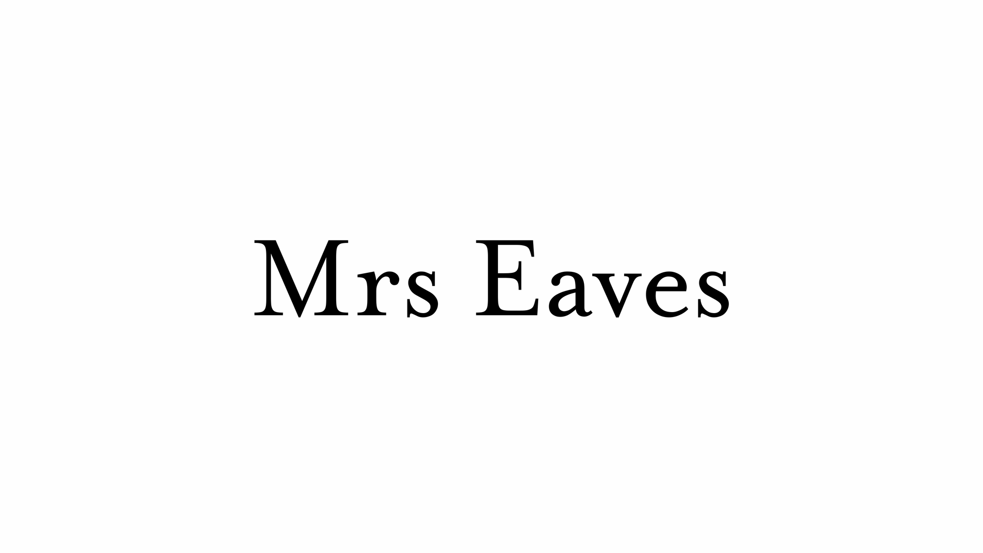
Mrs Eaves is a transitional serif typeface designed by Zuzana Licko in 1996. It is a variant of Baskerville, which was designed in Birmingham, England, in the 1750s. Mrs Eaves adapts Baskerville for use in display contexts, such as headings and book blurbs, through the use of a low x-height and a range of unusual combined characters or ligatures. Mrs Eaves was released by Emigre, a type foundry run by Licko and husband Rudy VanderLans, and has been joined by an 'XL' version for body text, as well as Mr Eaves, a sans-serif companion.

News Gothic is a sans-serif typeface designed by Morris Fuller Benton, and was released in 1908 by his employer American Type Founders (ATF). The typeface is similar in proportion and structure to Franklin Gothic, also designed by Benton, but lighter.
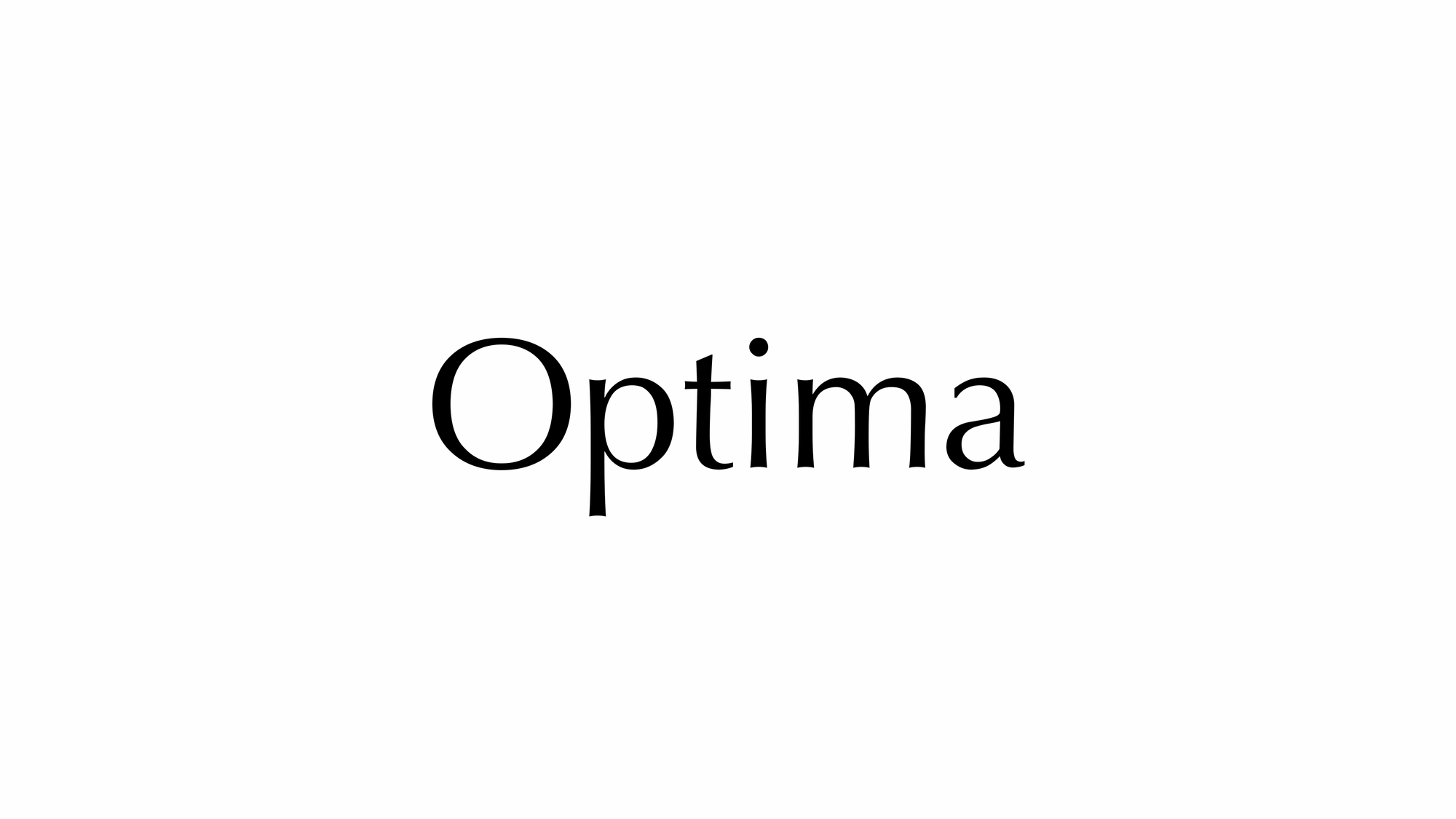
Optima is a humanist sans-serif typeface designed by Hermann Zapf and released by the D. Stempel AG foundry, Frankfurt, West Germany in 1958. Though classified as a sans-serif, Optima has a subtle swelling at the terminals suggesting a glyphic serif. Optima was inspired by classical Roman capitals and the stonecarving on Renaissance-period tombstones Zapf saw in Florence on a 1950 holiday to Italy.
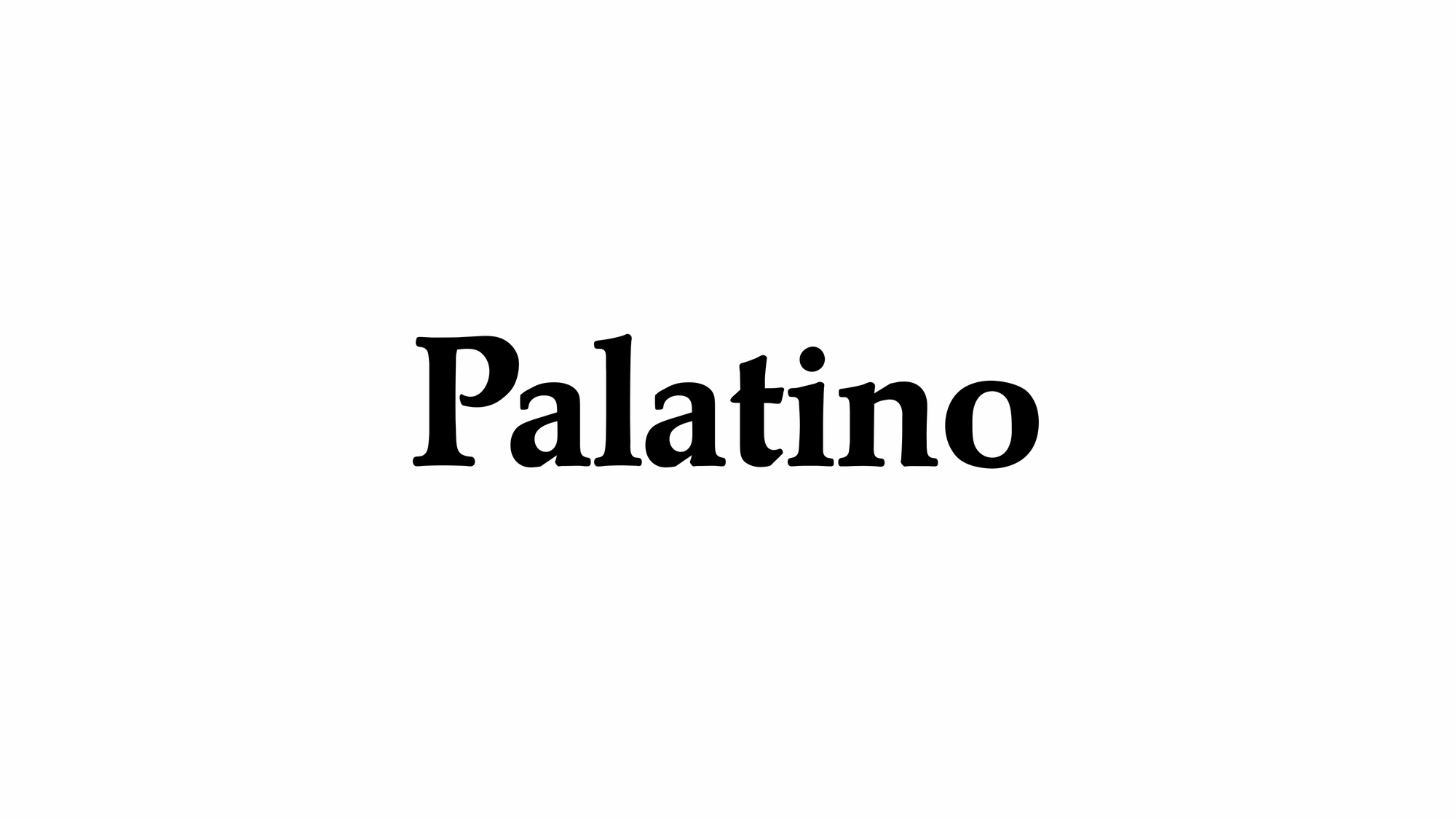
Palatino is an old-style serif typeface designed by Hermann Zapf, initially released in 1949 by the Stempel foundry and later by other companies, most notably the Mergenthaler Linotype Company.[a] Palatino is optimised for legibility with open counters, balanced proportions, moderate stroke contrast and flared serifs.
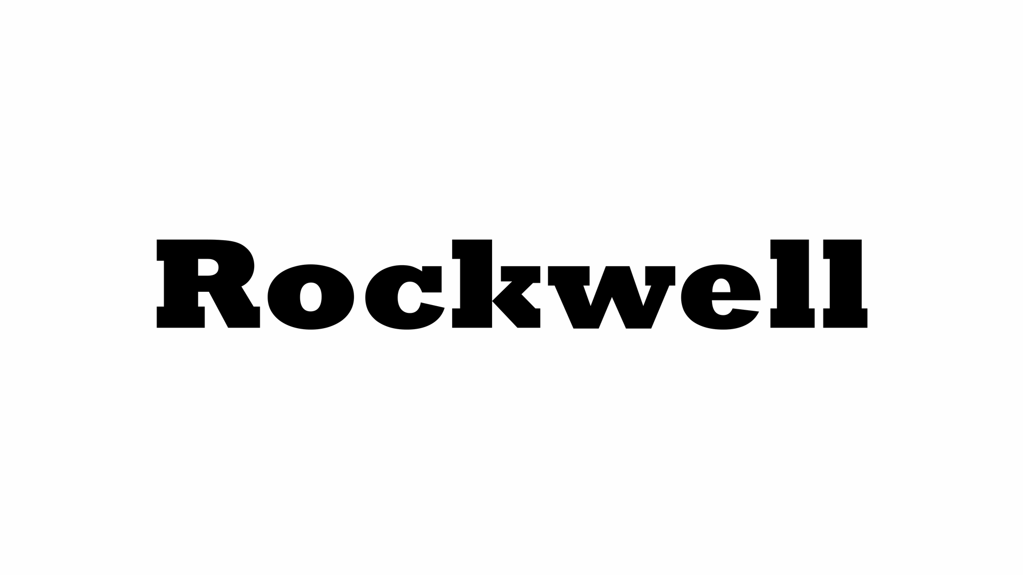
Rockwell is a slab serif typeface designed by the Monotype Corporation and released in 1934. The project was supervised by Monotype's engineering manager Frank Hinman Pierpont. This typeface is distinguished by a serif at the apex of the uppercase A, while the lowercase a has two storeys. Because of its monoweighted stroke (meaning there is virtually no visible thick/thin transition in the strokes, so the letterforms are the same thickness all the way around), Rockwell is used primarily for display or at small sizes rather than as a body text. Rockwell is based on an earlier, more condensed slab serif design cast by the Inland Type Foundry called Litho Antique.
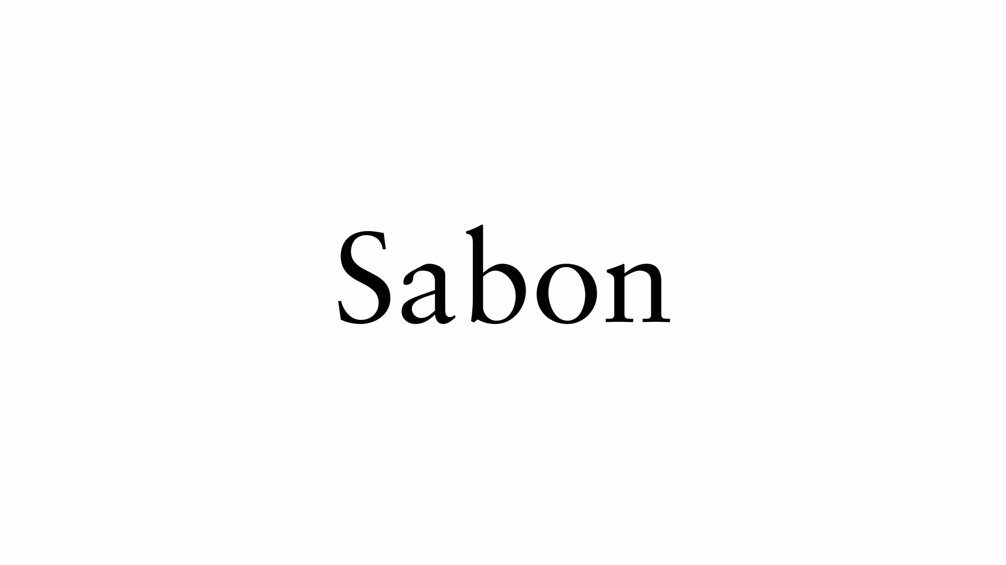
Sabon is an old-style serif typeface designed by the German-born typographer and designer Jan Tschichold (1902–1974) in the period 1964–1967. It was released jointly by the Linotype, Monotype, and Stempel type foundries in 1967. The design of the roman is based on types by Claude Garamond (c. 1480–1561), particularly a specimen printed by the Frankfurt printer Konrad Berner. Berner had married the widow of a fellow printer Jacques Sabon, the source of the face's name, who had bought some of Garamond's type after his death. The italics are based on types designed by a contemporary of Garamond's, Robert Granjon. It is effectively a Garamond revival, though a different name was chosen as many other modern typefaces already carry this name.
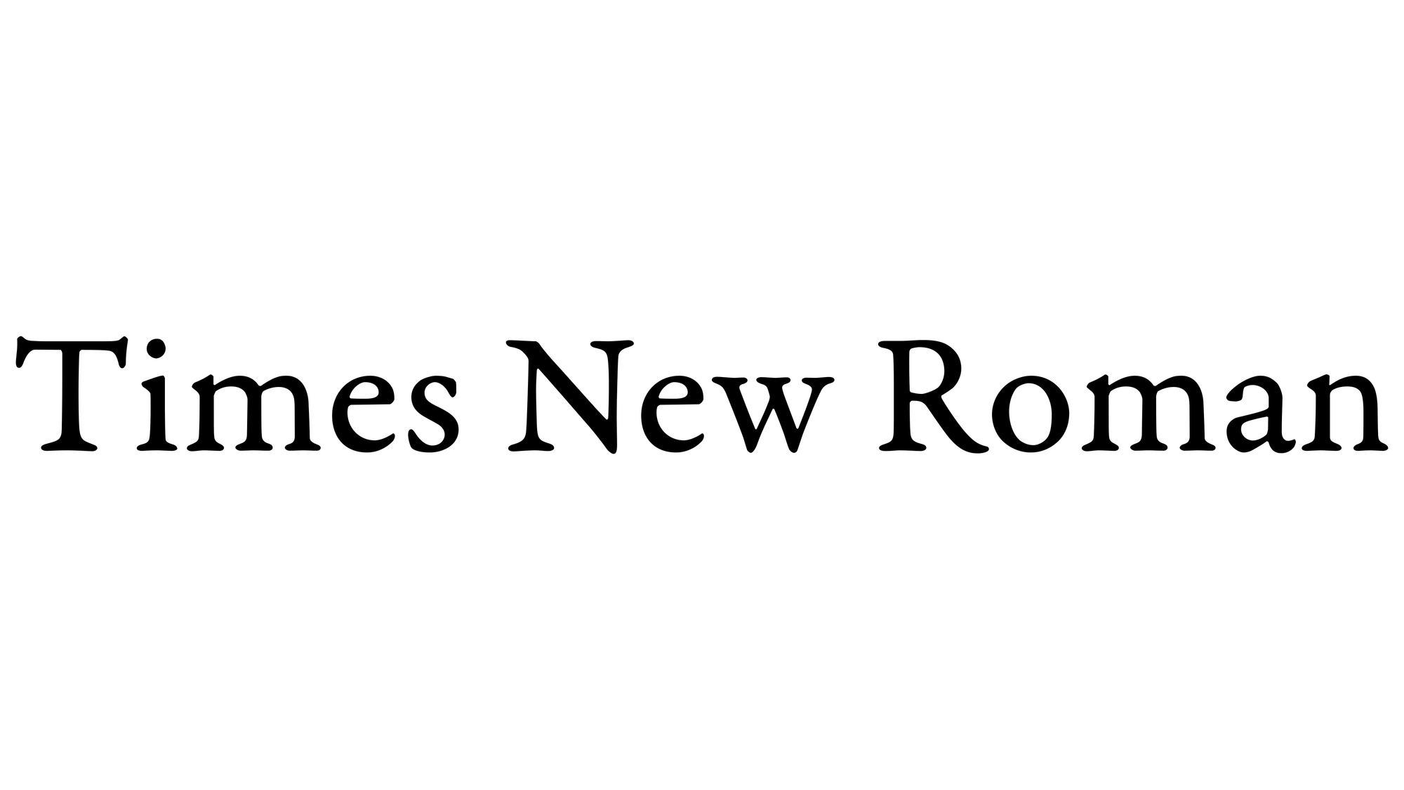
Times New Roman is a serif typeface commissioned for use by the British newspaper The Times in 1931. It has become one of the most popular typefaces of all time and is installed on most personal computers. The typeface was conceived by Stanley Morison, the artistic adviser to the British branch of the printing equipment company Monotype, in collaboration with Victor Lardent, a lettering artist in The Times's advertising department.
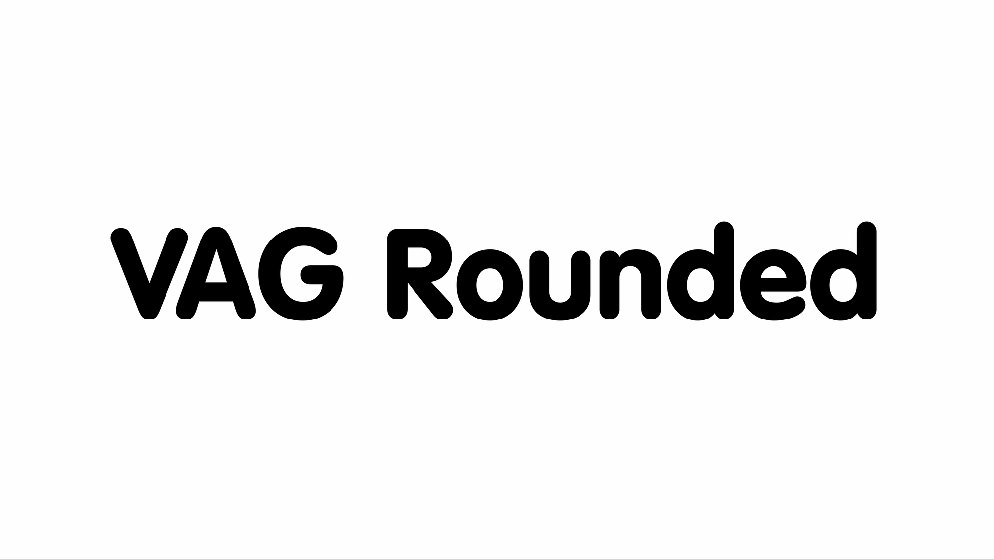
VAG Rundschrift or VAG Rounded (Rundschrift is German for 'round typeface', short of abgerundete Schrift, 'rounded typeface') is a geometric sans-serif typeface that was designed as a corporate typographic voice for the Volkswagen AG motor manufacturer. It resembles Futura, but features rounded terminals on all strokes. Volkswagen stopped using the VAG Rounded family in the early 1990s, and it is widely available today, licensed through Adobe Systems.
Notable Typefaces I Have Not Acquired Or Installed
Bell Gothic is a sans-serif typeface in the industrial or grotesque style, designed by Chauncey H. Griffith in 1938 while heading the typographic development program at the Mergenthaler Linotype Company. The typeface was commissioned by AT&T as a proprietary typeface for use in telephone directories, and has since been made available for general licensing. Bell Gothic is designed for maximum legibility in the adverse conditions of small print on poor-quality newsprint paper, into which ink tends to absorb and spread out. It is therefore a popular font in printing at small sizes. AT&T replaced Bell Gothic with Matthew Carter's typeface Bell Centennial in 1978, the one-hundredth anniversary of AT&T's founding.
Typefaces Listed Just Once
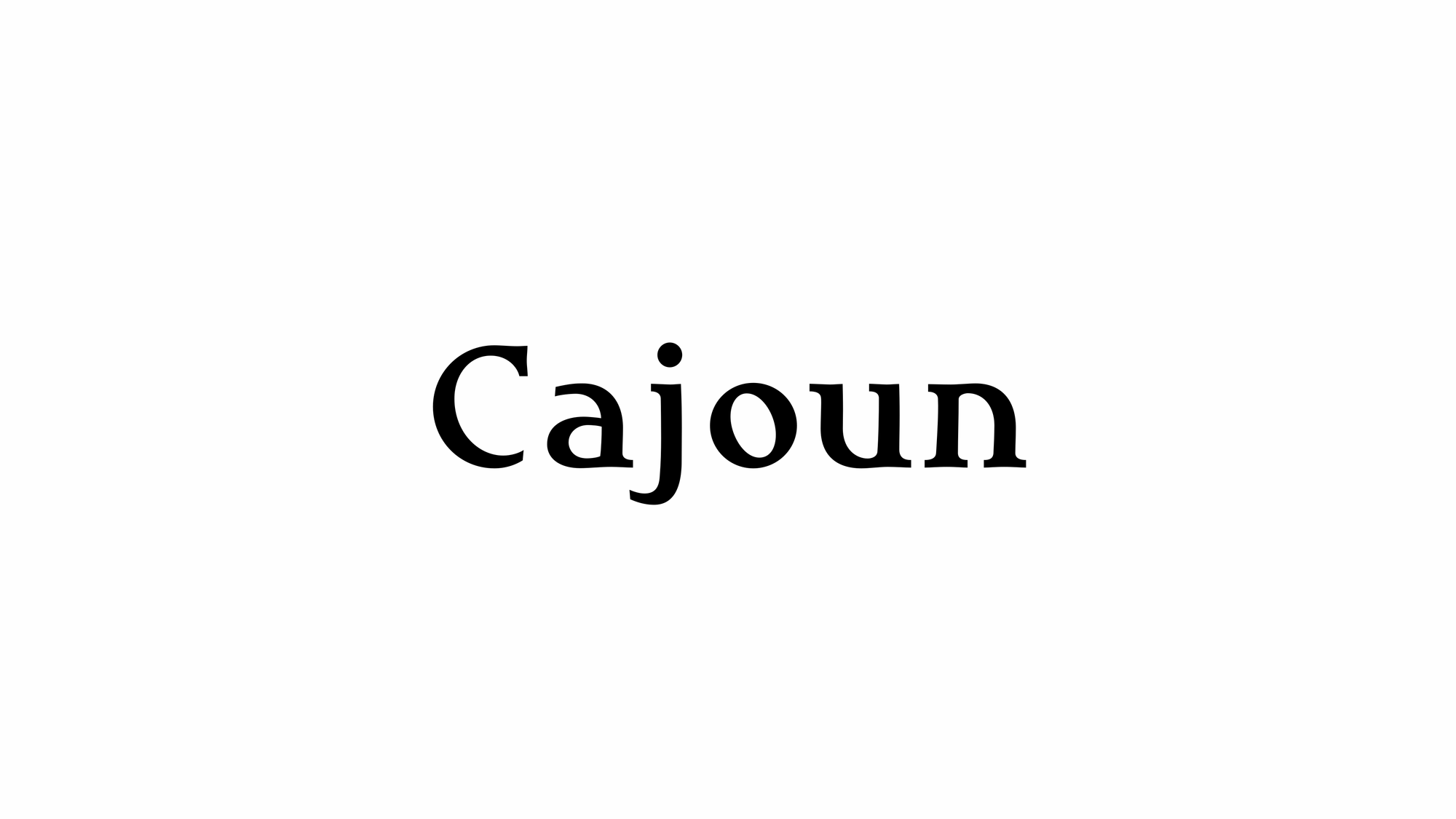
Cajoun is a bold serif face from German designer Hans-Jürgen Ellenberger. The letters sit visually low on their baseline, in part due to their small x-height. Also, the curved portions of the letterforms have an old-style distribution of weight, which pulls the eye downward. This font has a contemporary feel, however, with crisp edges, and some pointy terminals. The typeface also contains old style figures. Cajoun is recommended for use in larger applications, where the eye can get a change to dance along its wide curves. Cajoun was designed in 2002, and is part of the Take Type 5 collection from Linotype GmbH." From myfonts.com.
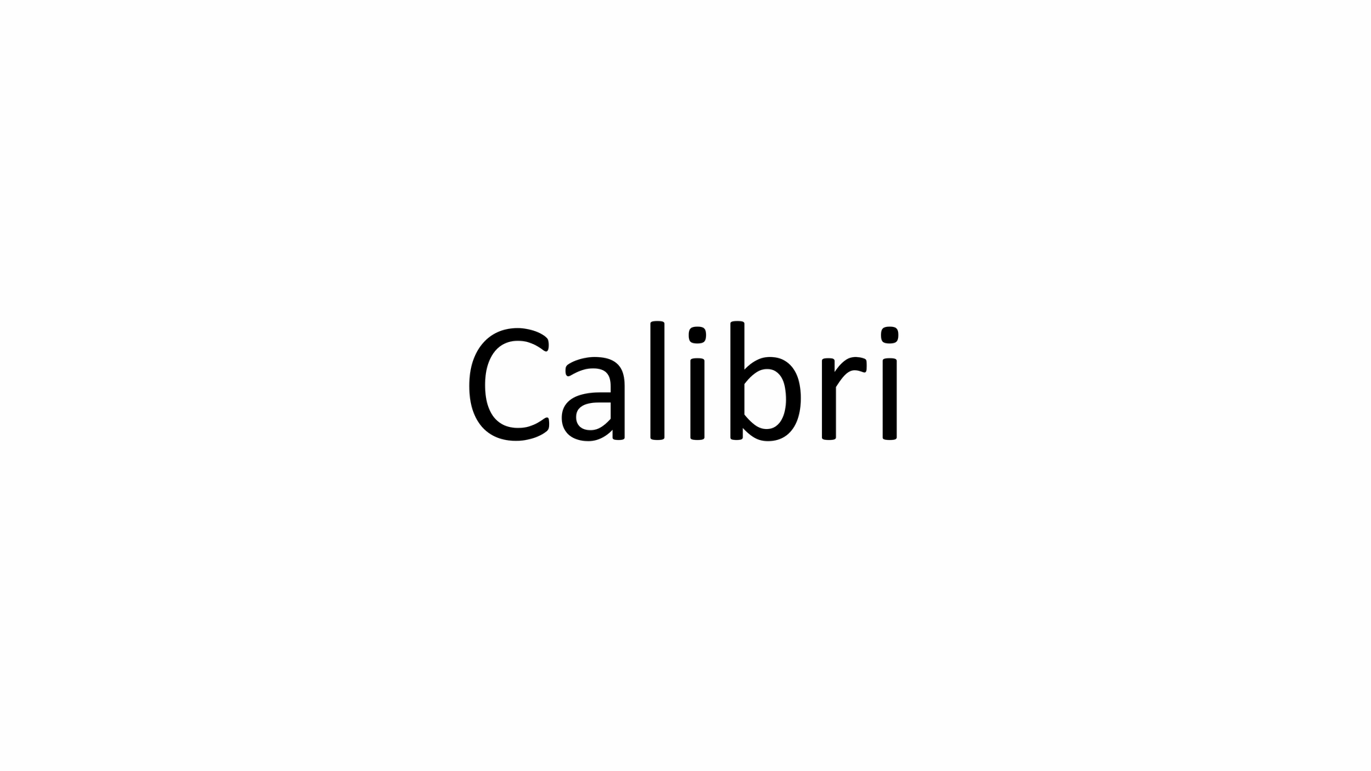
Calibri is a digital sans-serif typeface family in the humanist or modern style. It was designed by Lucas de Groot in 2002–2004 and released to the general public in 2006, with Windows Vista. In Microsoft Office 2007, it replaced Times New Roman as the default font in Word and replaced Arial as the default font in PowerPoint, Excel, and Outlook. In Windows 7, it replaced Arial as the default font in WordPad. De Groot described its subtly rounded design as having "a warm and soft character". In January 2024, the font was replaced by Microsoft's new bespoke font, Aptos, as the new default Microsoft Office font, after 17 years.
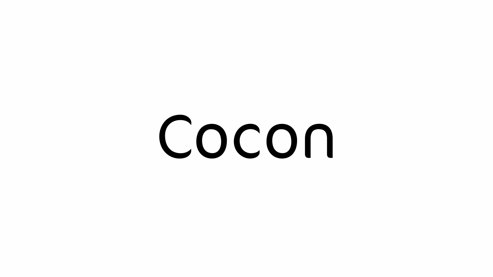
FF Cocon’s designer, Evert Bloemsma (1958—2005) described it as a “serious typeface”. Despite first impressions, the description holds up well. Since its 2001 release, FF Cocon has been used in an astoundingly wide variety of design applications. At large sizes, FF Cocon works as a display face, with beautiful detailing. And at small sizes, it remains surprisingly readable. From myfonts.com.
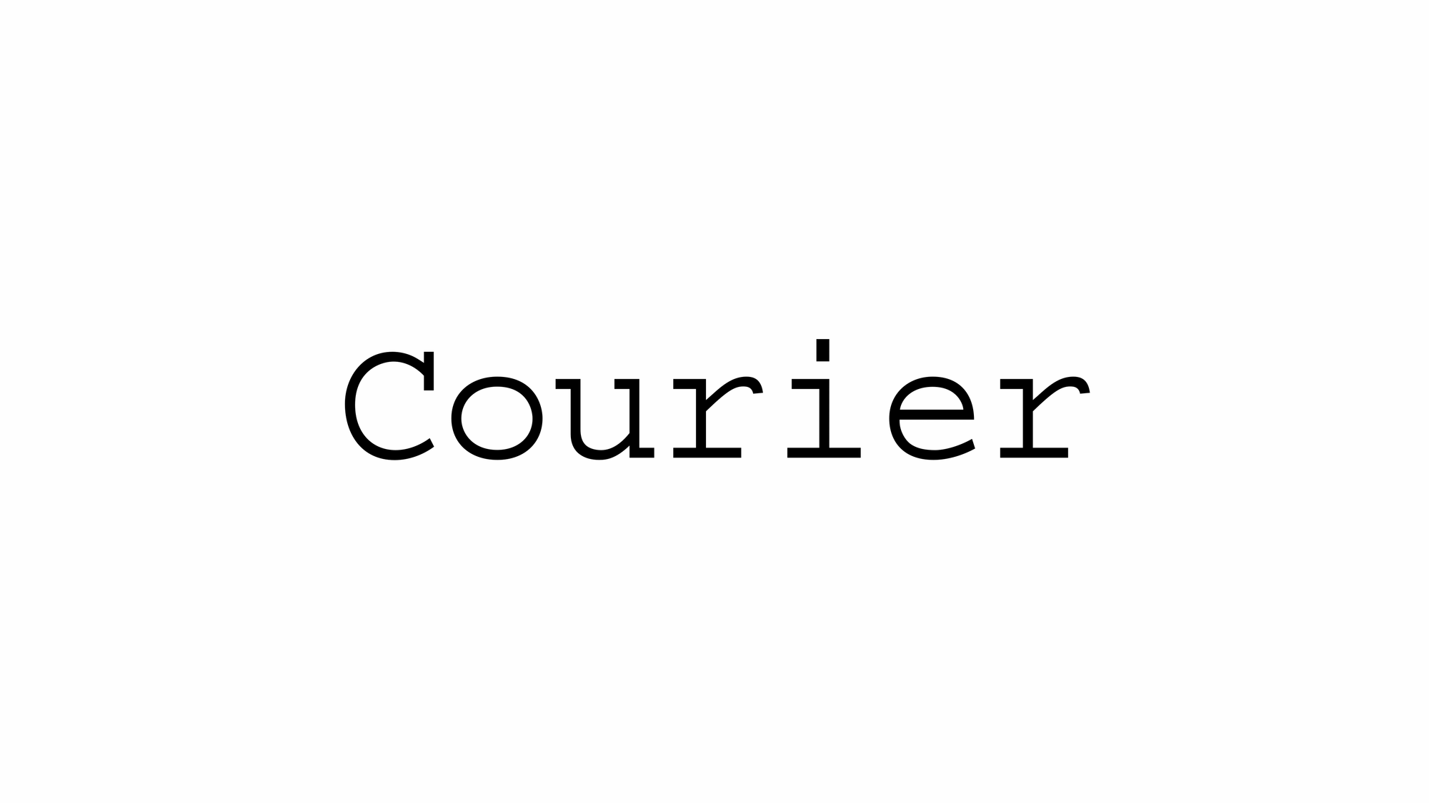
Courier is a monospaced slab serif typeface commissioned by IBM and designed by Howard "Bud" Kettler (1919–1999) in the mid-1950s. The Courier name and typeface concept are in the public domain. Courier has been adapted for use as a computer font, and versions of it are installed on most desktop computers.
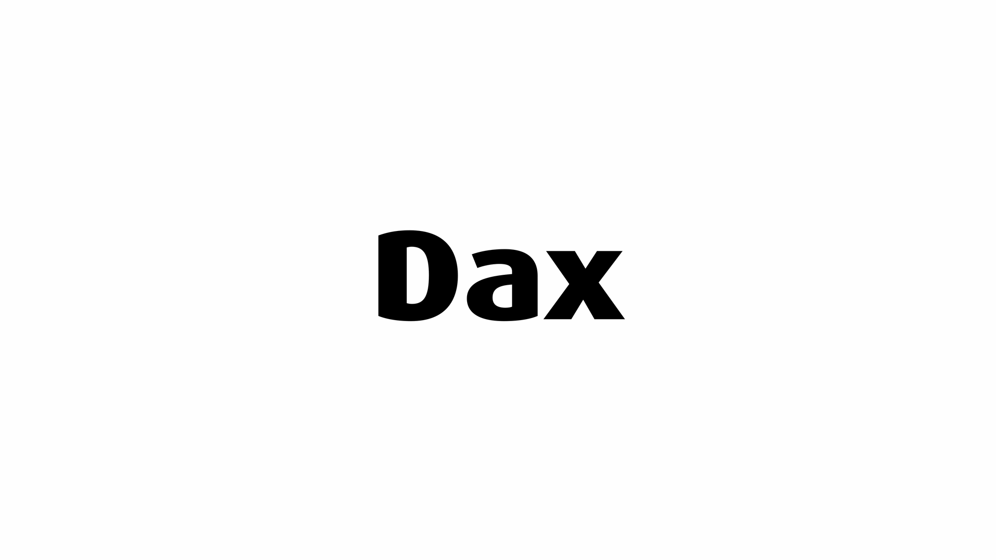
FF Dax is a humanist sans-serif typeface designed by Hans Reichel, published by FontFont library. The typeface is popular in advertising and in marketing. It is a "spurless" sans-serif, similar to typefaces like Semplicità and some characters in Gill Sans, where strokes end without terminals. This gives it a modernist, abstract feeling, detached from handwriting principles. Other designs, Barmeno and Sari, more bulbous cousins of FF Dax, have also been designed by Reichel. In 2005, Hans Reichel reworked FF Dax into a cleaner, more mature text face called FF Daxline and FF Daxline Office Pro.

Didot is a group of typefaces. The word/name Didot came from the famous French printing and type-producing Didot family. The classification is known as modern, or Didone. The most famous Didot typefaces were developed in the period 1784–1811. Firmin Didot (1764–1836) cut the letters, and cast them as type in Paris. His brother, Pierre Didot (1760–1853) used the types in printing. His edition of La Henriade by Voltaire in 1818 is considered his masterwork. The typeface takes inspiration from John Baskerville's experimentation with increasing stroke contrast and a more condensed armature. The Didot family's development of a high contrast typeface with an increased stress is contemporary to similar faces developed by Giambattista Bodoni in Italy. Didot is described as neoclassical, and evocative of the Age of Enlightenment. The Didot family were among the first to set up a printing press in the newly independent Greece, and typefaces in the style of Didot have remained popular in Greek since.
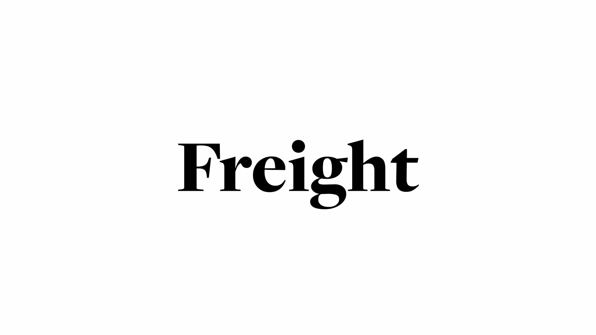
Freight. The Freight Collection comprises a compelling array of intertwined typeface families ready to add unique style to any project. What Joshua Darden started as a serif family inspired by the warmth and pragmatism found in 18th-century Dutch typefaces now ranges across multiple weights, widths, and optical sizes — from Big, Display, Text, Micro, Macro, and Sans — all of which include companion italics. That’s 156 fonts that can be bold and daring as effortlessly as they can be quiet and unassuming. From fonts.adobe.com.
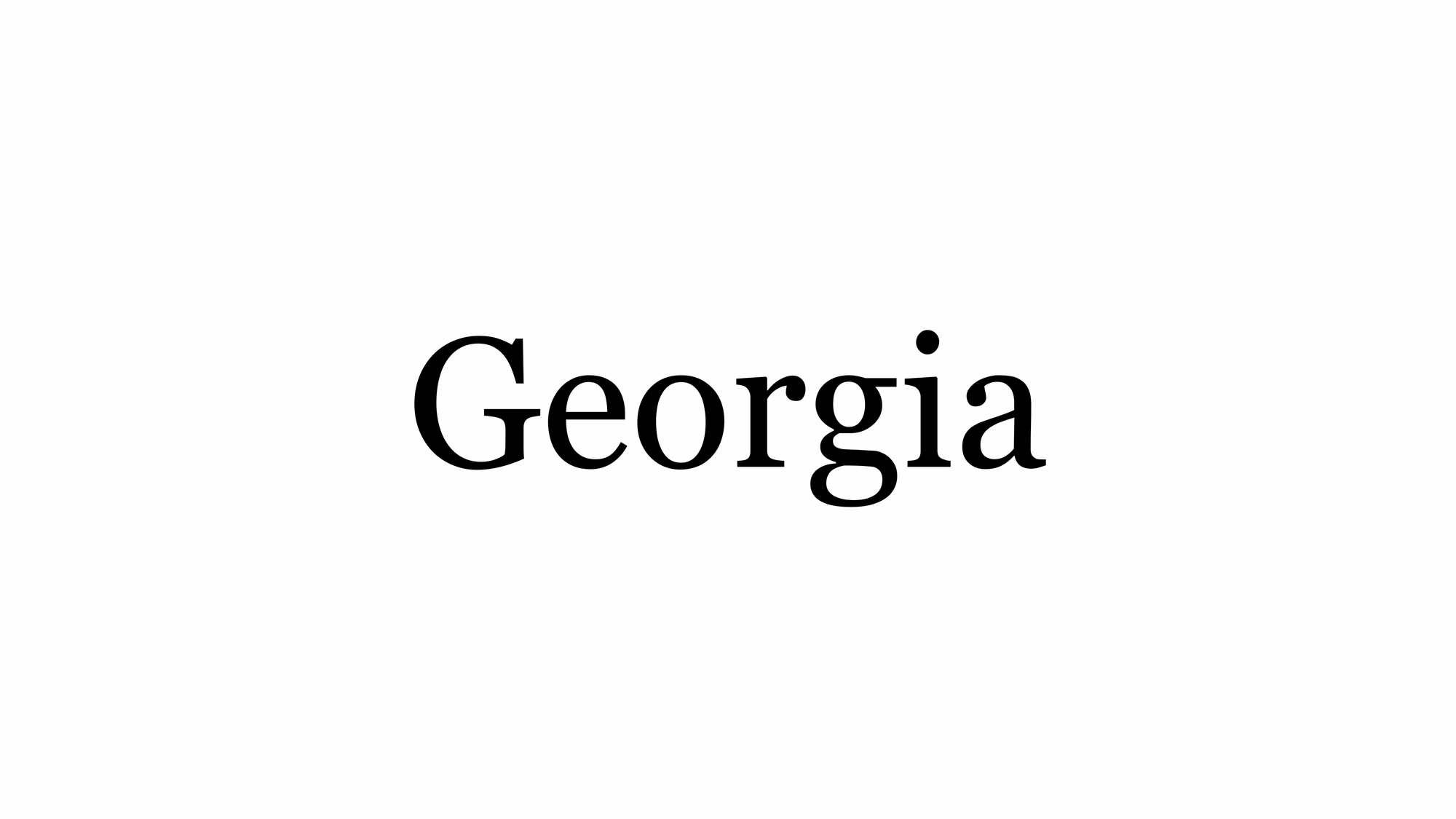
Georgia is a serif typeface designed in 1993 by Matthew Carter and hinted by Thomas Rickner for Microsoft. It was intended as a serif typeface that would appear elegant but legible when printed small or on low-resolution screens. The typeface is inspired by Scotch Roman designs of the 19th century and was based on designs for a print typeface on which Carter was working when contacted by Microsoft; this would be released under the name Miller the following year. The typeface's name referred to a tabloid headline, "Alien heads found in Georgia."
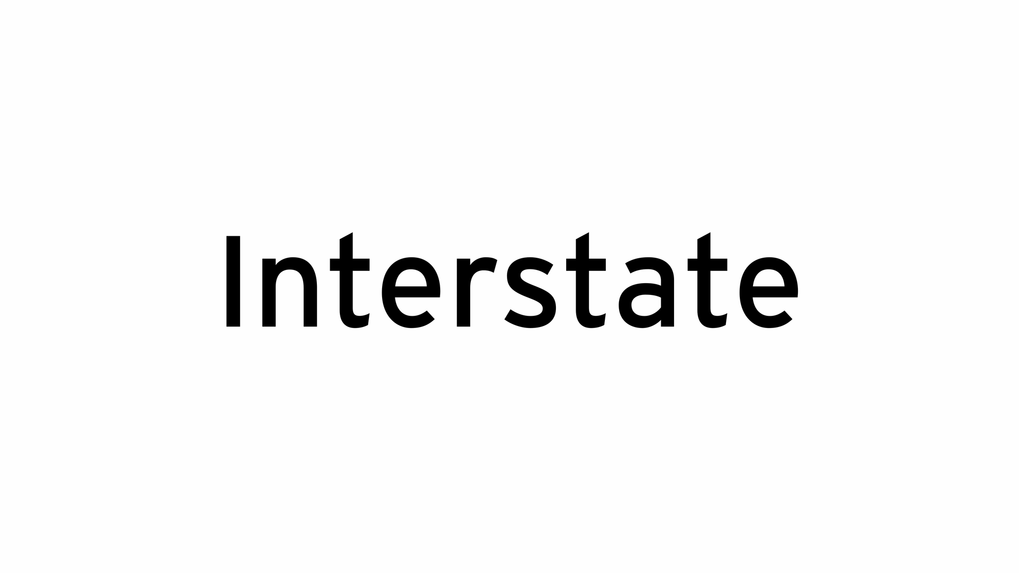
Interstate is a digital Typeface designed by Tobias Frere-Jones between 1993 and 1999, and licensed by Frere-Jones Type. The typeface is based on the FHWA series of fonts, a series of signage alphabets drawn for the Federal Highway Administration by Dr. Theodore W. Forbes in 1949, assisted by J.E. Penton and E.E. Radek. Frere-Jones' Interstate typeface, while optimal for signage, has refinements making it suitable for text setting in print and on-screen, and gained popularity as such in the 1990s. Due to its wide spacing, it is best suited for display usage in print.
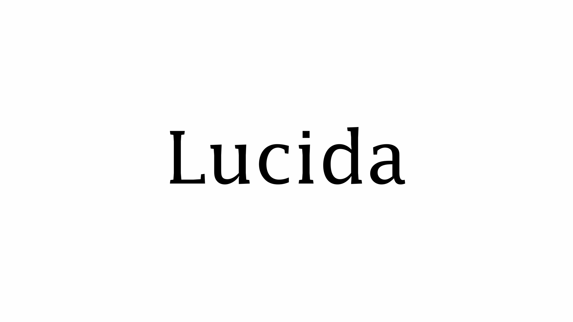
Lucida is an extended family of related typefaces designed by Charles Bigelow and Kris Holmes and released from 1984 onwards. The family is intended to be extremely legible when printed at small size or displayed on a low-resolution display – hence the name, from 'lucid' (clear or easy to understand). There are many variants of Lucida, including serif (Fax, Bright), sans-serif (Sans, Sans Unicode, Grande, Sans Typewriter) and scripts (Blackletter, Calligraphy, Handwriting). Many are released with other software, most notably Microsoft Office. Bigelow and Holmes, together with the (now defunct) TeX vendor Y&Y, extended the Lucida family with a full set of TeX mathematical symbols, making it one of the few typefaces that provide full-featured text and mathematical typesetting within TeX. Lucida is still licensed commercially through the TUG store as well through their own web store. The fonts are occasionally updated.
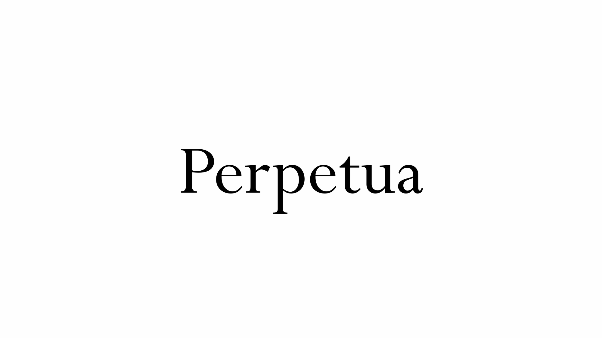
Perpetua is a serif typeface that was designed by the English sculptor and stonemason Eric Gill for the British Monotype Corporation. Perpetua was commissioned at the request of Stanley Morison, an influential historian of printing and adviser to Monotype around 1925, when Gill's reputation as a leading artist-craftsman was high. Perpetua was intended as a crisp, contemporary design that did not follow any specific historic model, with a structure influenced by Gill's experience of carving lettering for monuments and memorials. Perpetua is commonly used for covers and headings and also sometimes for body text and has been particularly popular in fine book printing. Perpetua was released with characters for the Greek alphabet and a matching set of titling capitals for headings.
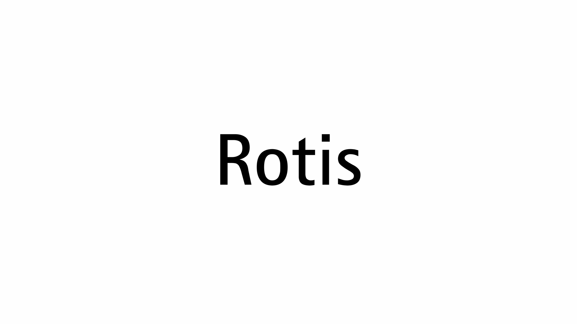
Rotis is a typeface developed in 1988 by Otl Aicher, a German graphic designer and typographer. In Rotis, Aicher explores an attempt at maximum legibility through a highly unified yet varied typeface family that ranges from full serif, glyphic, and sans-serif.
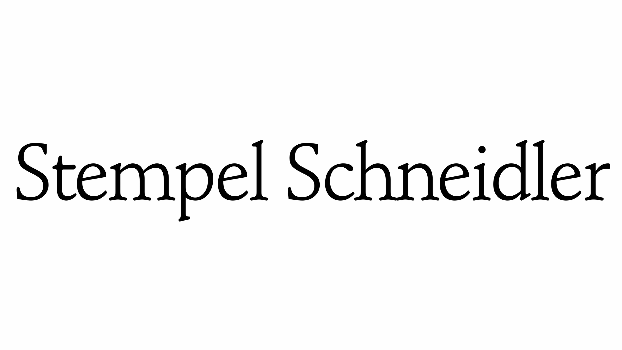
Stemple Schneidler is a serif typeface originally created by German designer F.H. Ernst Schneidler in 1936. It was first published through Bauer and later through Stempel. The design was inspired by Venetian types of the Renaissance and features distinctive cupped serifs. The most recognizable character in Schneidler is the question mark—it looks like the shape was rotated nearly 180° with the dot left behind on the bottom. From typewolf.com.
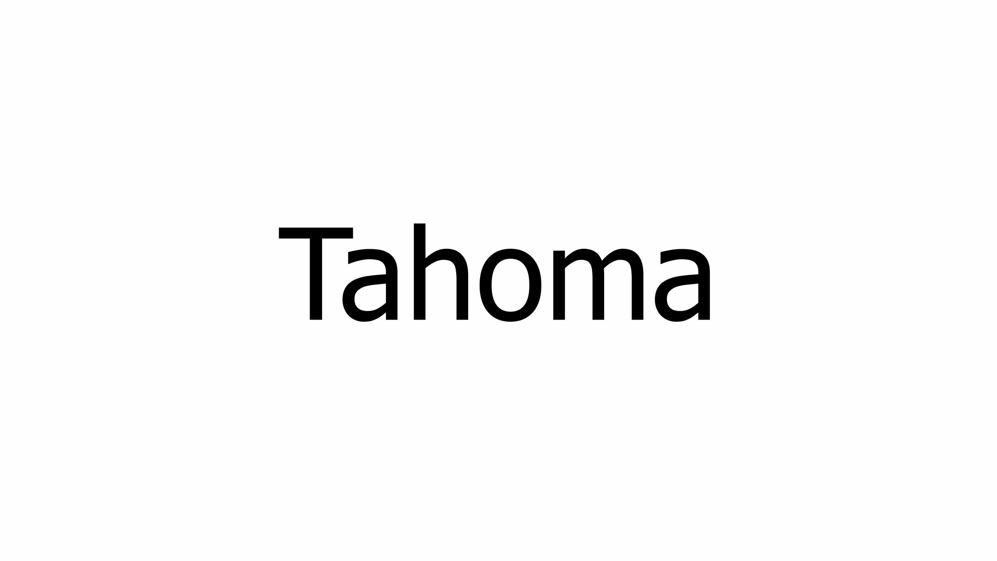
Tahoma is a humanist sans-serif typeface that Matthew Carter designed for Microsoft Corporation. Microsoft first distributed it, along with Carter's Verdana, as a computer font with Office 97. While similar to Verdana, Tahoma has a narrower body, smaller counters, much tighter letter spacing, and a more complete Unicode character set. Carter first designed Tahoma as a bitmap font, then "carefully wrapped" TrueType outlines around those bitmaps. Carter based the bold weight on a double pixel width, rendering it closer to a heavy or black weight. In contrast with some other sans-serif typefaces, including Arial, the uppercase "I" (eye) is distinguishable from lowercase "l" (ell), which is especially important in technical publications. Since 2010, Ascender Corporation has offered italic and small caps versions of Tahoma. In an interview by Daniel Will-Harris, Carter acknowledged that Tahoma has some similarities with his earlier Bell Centennial typeface.
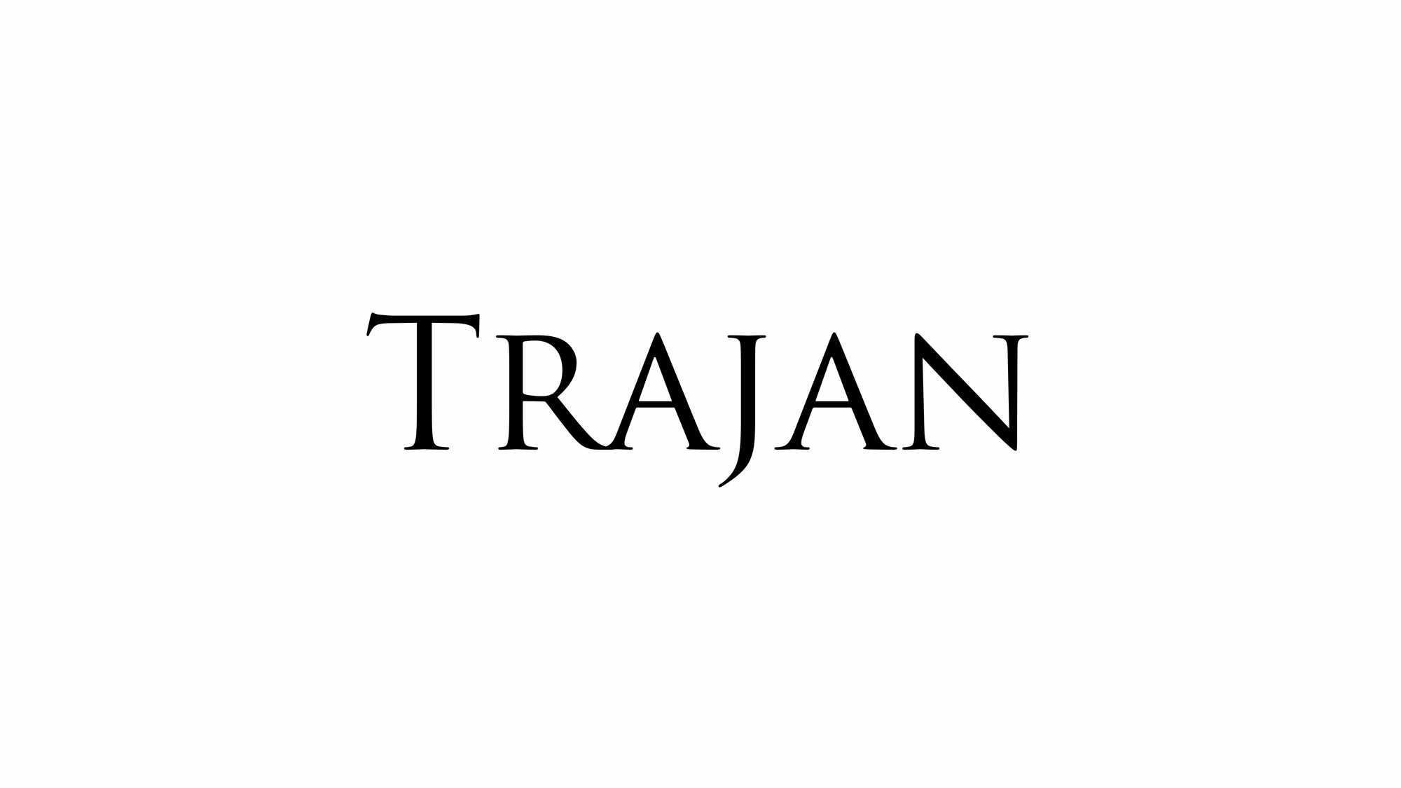
Trajan is a serif typeface designed in 1989 by Carol Twombly for Adobe. The design is based on the letterforms of capitalis monumentalis or Roman square capitals, as used for the inscription at the base of Trajan's Column, hence the name. Trajan is an all-capitals typeface, as the Romans did not use lowercase letters. Twombly created the design taking inspiration from a full-size picture of a rubbing of the inscription. It is well known for appearing on many film posters.
Trebuchet MS is a humanist sans-serif typeface that Vincent Connare designed for Microsoft Corporation in 1996. Trebuchet MS was the font used for the window titles in the Windows XP default theme, succeeding MS Sans Serif and Tahoma. Released free of charge by Microsoft as part of their core fonts for the Web package, it remained one of the most popular body text fonts on webpages as of 2009.
Notable Typefaces I Have Not Acquired Or Installed
Canela Collection began as an interpretation of Caslon, but gradually was taken in a new and unexpected direction, shedding its serifs and leaving only vestigial flaring at the ends of strokes, taking on a monumental quality influenced by the author’s experience with stone carving. Canela is a graceful display typeface that defies many of the traditional classifications. Its forms are in an ambiguous space between sans and serif, both soft and sharp, modern yet with roots in the classical. Canela debuted in issue 5 of fashion and art magazine Document Journal in 2014 and after that appeared on music album covers, Future Affairs 2019 conference identity and on an Italian Scooter Museum website. Optimized for use below 20 point, Canela Text brings the grace and distinction of Canela to longer text, and can also bring its elegance to small navigational elements. From type.today.
Century Gothic is a digital sans-serif typeface in the geometric style, released by Monotype Imaging in 1990.[1][2] It is a redrawn version of Monotype's own Twentieth Century, a copy of Bauer's Futura, to match the widths of ITC Avant Garde Gothic. It is an exclusively digital typeface that has never been manufactured as metal type.
Excelsior. Before designing this font, C.H. Griffith consulted the results of a survey of optometrists regarding optimal legibility. Excelsior font was then presented by Mergenthaler Linotype in 1931 and remains one of the most legible and popular fonts worldwide. From myfonts.com.
Impact is a sans-serif typeface in the industrial or grotesque style designed by Geoffrey Lee in 1965 and released by the Stephenson Blake foundry of Sheffield. It is well known for having been included in the core fonts for the Web package and distributed with Microsoft Windows since Windows 98. In the 2010s, it gained popularity for its use in image macros and other internet memes.
Open Sans is an open source humanist sans-serif typeface that was designed by Steve Matteson under commission from Google. It was released in 2011 and is based on his earlier design called Droid Sans, which was specifically created for Android mobile devices but with slight modifications to its width. The typeface is characterized by its wide apertures on many letters and a large x-height, making it highly legible on screens and at small sizes. Being part of the humanist genre of sans-serif typefaces, it also features a true italic style. As of July 2018, Open Sans is the second most widely used font on Google Fonts, serving over four billion views per day across more than 20 million websites.
Orpheus Pro is rooted in two late 1920s designs by Walter Tiemann, who had an impressive talent for combining classic Roman proportions and Art Deco sensibilities. It has become a standard font in packaging and entertainment design. From fonts.adobe.com.
Where To Find Fonts And Font Licensing
I feel that I have to talk about Monotype, a type foundry conglomerate which holds the licenses for many fonts. Recent acquisitions include: Helvetica, ITC Franklin Gothic, Optima, ITC Avant Garde, Palatino, FF DIN and Gotham. They are responsible for developing Times New Roman, Gill Sans, and Arial. You may have heard of one or two of them. All of these typefaces have their own Wikipedia entries, and I encourage you to read up on them. Monotype is a major force in the typographic world, both lauded and despised, but rarely avoided completely. The Wikipedia entry for Monotype Imaging is a good entry-point for a deep-dive on the recent history of mainstream typography.
There are type foundries who refuse acquisition in this article, for example. For a more extensive, but still incomplete list of foundries, typefaces, and designers, check out Atlas of Type.
Monotype
Fonts licensed by Monotype include: Times New Roman, Baskerville, Garamond, Helvetica, Gill Sans, Arial, Brush Script, Cooper Black, Rockwell, Futura and many others. The majority of Monotype's catalog is available for purchase officially at this web site:
Adobe
Fonts licensed by Adobe include: Orpheus, ITC Avant Garde Gothic, Neue Haas Grotesk, Minion, Franklin Gothic, Baskerville, Mrs Eaves, Gill Sans, Sabon, Futura (the Adobe rendition is not recommended), Sabon, Freight, and many others.
Apple
No one can seem to get a straight answer from Apple about licensing for commercial use. If you don't believe me, open a support ticket and try your luck! I think that is because they have licensed most of the fonts they use themselves. As far as I can tell the license they currently hold for most fonts is a preview license specific to Apple products only, not a commercial reseller license. This restricts the use of fonts distributed with Apple products to Apple products alone. They do not offer commercial licenses and are not in the font business. Which is weird because they practically started the desktop-publishing revolution. Boo. Hiss.
Microsoft
Even more evasive and byzantine than Apple is Microsoft. Millions of people around the world break Microsoft copyright law every day without knowing it. Read the fine print –you have to open their font files in a text editor and scroll past garbled data to see the full text of the license provided with each font.
"Can I use any font in a commercial product? Yes, you can use them commercially, and even include them within a product that is sold commercially. Usage and redistribution conditions are specified in the license. The most common license is the SIL Open Font License. Some fonts are under the Apache license or Ubuntu Font License. You can redistribute open source fonts according to those conditions." This is the way. Bravo Google.
For one designer's opinion on the best Google fonts, I recommend this article:
https://www.typewolf.com/google-fonts
Fontsource
Fontsource is a collection of open-source fonts outside the Google ecosystem. Nearly two-thousand font families are represented and free to download with no ads. Good work.
The Open Font License And Open Source Typefaces
Many open source fonts have adopted the Open Font License. Read about the Open Font License.
If you don't think an open source font can look good, Open Foundry will probably change your mind.
Open Foundry WebsiteWho Owns That Typeface?
To find out who holds the license for a particular typeface, use the Identifont website.
Identify Fonts By Dragging And Dropping An Image
https://www.myfonts.com/pages/whatthefont
Custom Typefaces
Have you ever wondered what typeface is used in a brand? There are specialty type foundries that specialize in brand-development, such as Production Type. Companies like this will develop a custom typeface for a company for the right price, and often provide other services through partners like brand development, art direction, web development, social media management, etc.
Font viewing software
Font Manager for Linux.
Font Book is installed by default on OS X. I've read that Typeface 3 for OS X is an excellent font viewing program.
This article from Digital Citizen describes how to view and install fonts in Windows 11 and Windows 10. Looks needlessly complex to me. Sheesh.
Using Your Beautiful New Fonts With Vector Drawing Programs
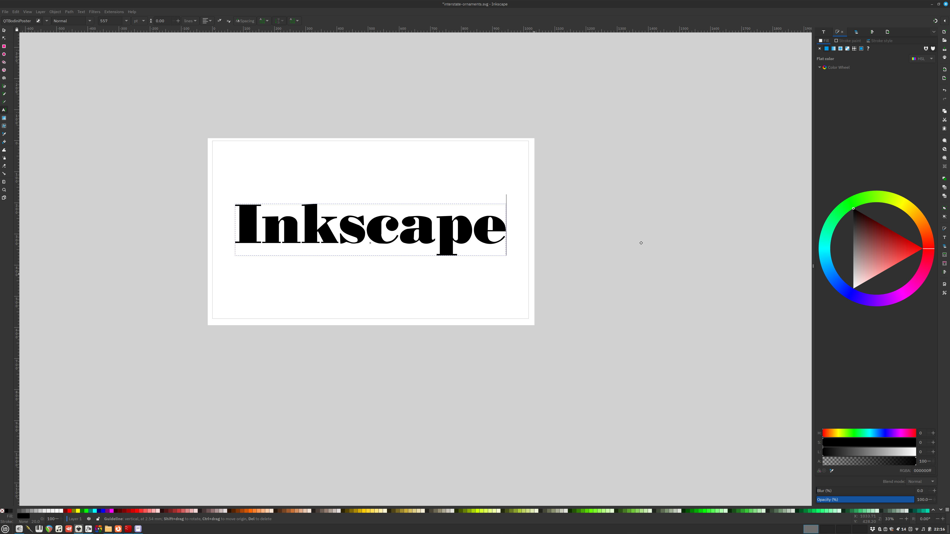
You may be wondering how I set the type on the images on this page. I use Inkscape because it is compatible with Linux, it does everything I need it to do, and it's free and open-source. Inkscape is yet another deep-dive, and I've only dipped my toe in so far. Other stand-outs which are commercial, paid options include Adobe Illustrator and CorelDRAW. There are a few other contenders worthy of your consideration, but I am only just now getting back into design and typography after a break of many years. I have not read up on all the options you should consider in 2025. To help you navigate this topic and possibly choose one for yourself, this is a great in-depth article on the state-of-the-art vector drawing programs in 2025 from softwarehow.com.
Oh and Inkscape comes with a document template for designing your own typefaces from scratch. Pretty cool (I didn't design the one displayed by the way, can you guess what it is?).
The History Of Digital Typography
Typography is such a huge topic, you can't take it all in at once. This article is as much a springboard for my own studies as it is for yours. My recommendation is to simply click on one of the Wikipedia entries listed above and start reading. If you're anything like me, soon you'll find yourself six or seven links deep and it will be two o'clock in the morning. Like in any subject, there are many thousands of fortuitous meetings, hand-offs and collaborations. One in particular stood out to me, the collaboration between Donald Knuth, venerated computer scientist and Charles Bigelow, type designer responsible for the Lucida typeface. You can read about it in this rather dry article on the Stanford University website, Digital Typography at Stanford.

Future Articles On Typography
There are so many facets to discuss on the subject. Type design, anatomy, setting, font combinations, integrating type with graphics. The truth is I am just getting back into the world of typography and graphic design and I haven't collected and processed enough information to pass on to you yet. It is likely that I will continue to be interested in typography and design. Like writing, music, and computers, it is a true passion of mine. If you subscribe, you'll be the first to know when I post a new article. I typically post about once a week, and I don't usually send newsletters in-between, so your inbox won't get flooded with garbage from me.
That's All Folks!
Well, that's all I got for now. I didn't have the bandwidth to talk about combining fonts, or anything really other than showcasing some of the typefaces I downloaded based on the recs of random web sites. A rather plebeian start to my reignited interest in typography. I don't care. It was fun. Maybe this will get someone fired up for typefaces, and typography. I hope so. I hope you learned something new. I sure did.